Image Stream Section
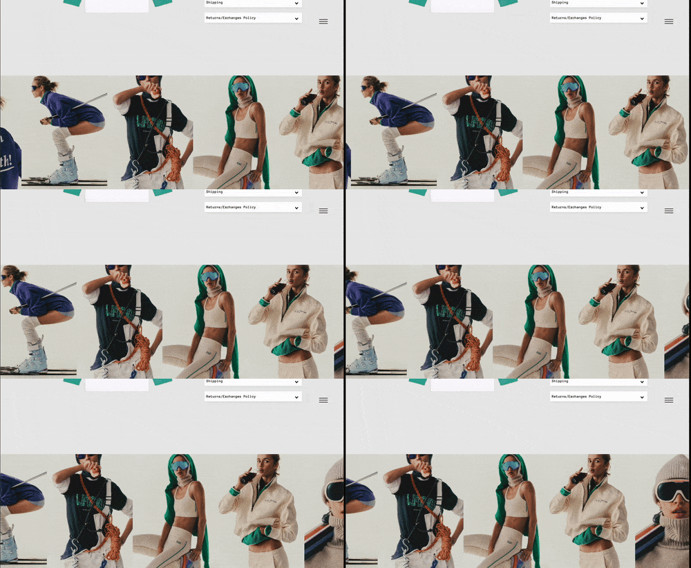
The Image Stream section is a horizontally scrolling row of images, great for displaying campaign shots, editorial looks, or brand highlights.
What You’ll Learn
- How to create a horizontally scrolling image gallery
- How to control scroll speed, direction, and spacing
- How to add captions and links to images
- How to adjust layout and typography for desktop and mobile
🧩 Section Overview
The Image Stream section is a horizontally scrolling row of images, great for displaying campaign shots, editorial looks, or brand highlights. It adds motion to your storefront and can be set to scroll automatically.
How to Add the Section
- In the Shopify Theme Editor, click Add section
- Select Image Stream
- Drag the section to your preferred location on the page
Adding Images
Each image is added using a block called Image.
To add an image:
- Click Add Block, then select Image
- Upload or choose your image
- (Optional) Add a Caption – this appears below the image
💡 Tip: Keep captions short for a clean layout
Section Settings
Content & Links
- Section Title: Add a heading for the section (optional)
- View Link URL: Add a link to a product, collection, or page
- View Link Text: This is the button text, like "SHOP"
Colors
- Background Color: Set the background behind the stream
- Section Title Color: Set the heading and view link color
Layout & Display
- Images per row on desktop: Choose how many images show across (2 to 6)
- Image aspect ratio: Controls image shape (e.g., Portrait, Square, Landscape)
- Height Mode:
- Responsive: Images scale based on aspect ratio
- Full Height: Section fills the screen height (title and buttons are hidden)
Additional options:
- Reverse Stream Direction: Enable to scroll right-to-left
- Hide on mobile: Hides the entire section on phones
- Auto-scroll speed: Controls how fast images move (measured in pixels per second)
⚠️ Slower scroll speeds look smoother and are easier to follow
Typography Settings
- Section Header Size (Desktop): Default is 16px
- Section Header Size (Mobile): Default is 14px
- Bold Section Title: Toggle on/off
- Bold View Link: Toggle on/off
Spacing Settings
You can adjust spacing for both desktop and mobile.
Desktop Spacing
- Top: 20px
- Bottom: 20px
Mobile Spacing
- Top: 16px
- Bottom: 16px
Gap Between Images
- Choose from: None, Small, Medium, or Large
💡 Tip: Use "None" for a seamless look, or add spacing to let each image breathe
Section Structure Example
The section includes multiple image blocks, each with its own image and caption.
Example:
- Image – Look 1
- Image – Look 2
- Image – Look 3
- Image – Look 4
Need Help?
- 💬 Join our community on Discord: https://discord.gg/hcc2GvgZc6
- 📧 Email us at: support@openspaces.design
- 💻 Live chat with us: Available Monday–Friday, 10AM–6PM EST, directly on our website