Product Carousel Section
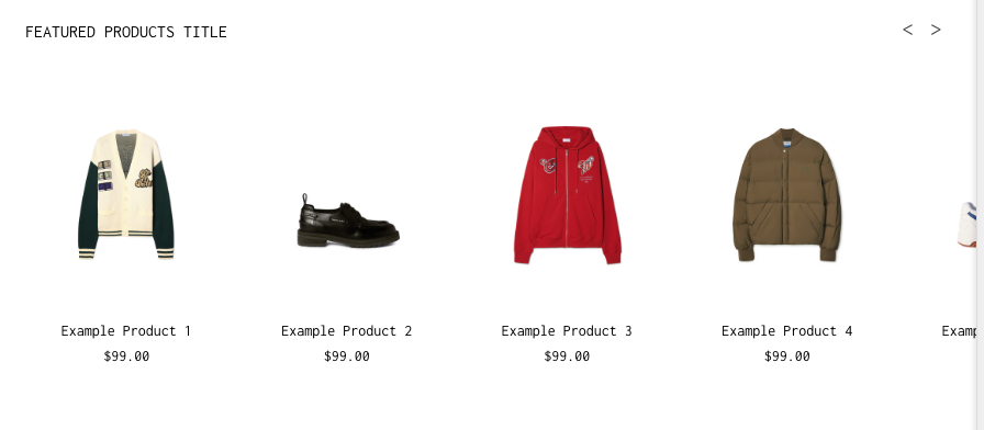
The Product Carousel section displays a scrollable row of featured products. It’s ideal for promoting a specific collection or highlighting bestsellers.
What You’ll Learn
- How to display products in a horizontally scrollable layout
- How to customize product labels, pricing, and badges
- How to adjust product spacing, typography, and colors
- How to set desktop and mobile layout preferences
🧩 Section Overview
The Product Carousel section displays a scrollable row of featured products. It’s ideal for promoting a specific collection or highlighting bestsellers. Products can include pricing, labels (like “Sale” or “Sold Out”), and custom layout settings.
How to Add the Section
- In the Shopify Theme Editor, click Add section
- Choose Product Carousel
- Drag and drop the section where you want it on the page
Content & Data Settings
- Section Title: Add a heading for the carousel (e.g., “Featured Products”)
- Shop Link Text: Add a call-to-action button (e.g., “Shop All”)
- Shop Link URL: Paste a collection or page link
Layout & Display Options
- Product Text Alignment: Align titles left, center, or right
- Toggle the following options:
- Show Product Titles
- Show Product Prices
- Show Compare at Price
- Show Sold Out Badge
- Show Sale Badge
- Show Pre-Order Badge
💡 Tip: Enable badges to highlight discounts or stock status.
- Products per Row – Desktop: Choose how many products to display (1–6)
- Products per Row – Mobile: Choose between 1–3 products
Typography Controls
- Adjust font sizes independently for desktop and mobile:
- Section Header
- Product Title
- Product Price
- Optional: Toggle Bold styles for:
- Section Title
- View Link
- Product Title
Color Customization
- Background Color: Transparent, solid, or brand color
- Section Title & Link Color
- Arrow Color (navigation arrows)
- Product Title Color
- Product Price Color
Label colors for each badge:
- Pre-Order
- Sold Out
- On Sale
- Compare at Price
Each badge has both:
- Text color
- Background color
⚠️ Make sure text and background colors contrast clearly for legibility.
Spacing Settings
You can adjust spacing for better visual balance across screen sizes.
Desktop
- Top spacing: 20px
- Bottom spacing: 20px
Mobile
- Top spacing: 16px
- Bottom spacing: 16px
Additional controls:
- Space Between Section Header and Products
- Space Between Product Image and Info
- Space Between Product Title and Price
- Gap Between Products (Desktop and Mobile)
Navigation Context
Use the Navigation Context setting to define which collection customers stay in when clicking a product.
For example:
- If set to “Summer Collection,” clicking any product keeps customers browsing within that same collection.
If this is not set, clicking a product takes users to the product's standard page without collection context.
Need Help?
- 💬 Join our community on Discord: https://discord.gg/hcc2GvgZc6
- 📧 Email us at: support@openspaces.design
- 💻 Live chat with us: Available Monday–Friday, 10AM–6PM EST, directly on our website