Set up your header, menu and footer
Choose a header, add your logo and menu, write an announcement, set up the full-screen menu and fill in the footer.
Four pieces appear on every page: the Announcement bar at the very top, the header, Menu: Overlay (the full-screen menu the header's menu button opens) and the Footer. Change them once and every page changes.
Plain Jane has two headers:
- Header: Classic: a full-width bar with the menu, your logo and the icons. On computers it can show your menu's links across the bar.
- Header: Capsule: a small rounded bar inset from the edges, with your logo at one end and the icons and a menu button at the other.
Your store starts with the Announcement bar and Header: Classic.

Set it up
- Make your menu. In the Shopify admin, go to Content, then Menus. A link with links under it becomes a dropdown in the header and its own list in the full-screen menu.
- Pick the menu. In the editor, open Theme settings, then Menu, and choose it. Both headers and Menu: Overlay show it, on computers and phones.
- Add your logo. In Theme settings, open Logo and icons and add it under Logo. Until you do, your store name shows.
- Choose a header. To use Header: Capsule, add it from "Add section" in the Header category, then hide or remove Header: Classic. While both show, the editor outlines the extra one and puts a note in the corner of the preview.
- Set the logo size. Select the header and set Logo size to Small, Medium or Large, or Custom with Logo width.
- Arrange the icons. Search, Favorites, Account, Cart, and Currency and language are blocks in the header. Drag them into order or hide the ones you don't need.
- Write your announcement. Select the Announcement bar, open its Message block and replace "Free shipping on orders over $100". Add a Link if you like, and more Message blocks for more messages.
- Set up the full-screen menu. Select Menu: Overlay in the Overlays group of the sidebar. Selecting it opens it in the preview.
- Fill in the footer. Pick a menu for each Menu column and add your accounts to Social links.
- Save.
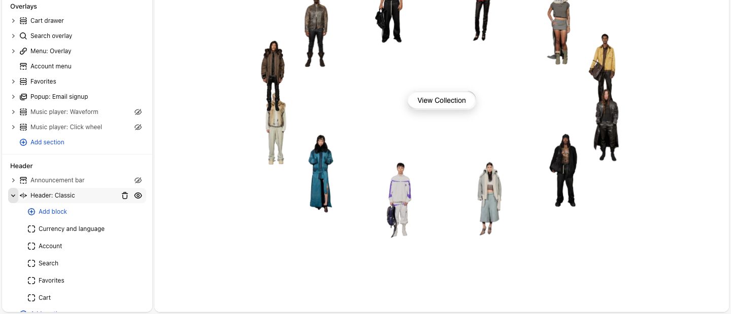
How the header sits over your photos
With Float over the page on (it starts on), Header: Classic sits on top of the first section. A full-width photo or video at the top of a page runs up behind the header and the Announcement bar. Other sections start below the header by themselves, so you never add space for it. Header: Capsule always floats.
Text and icons starts at Flip against the background: the bar has no background, and its words and icons turn light over dark parts of the page and dark over light ones. Choose Use color scheme for a solid bar in the header's Color scheme.
Your logo keeps its own colors. If it is one color on a see-through background (SVG or PNG), turn on Flip the logo too so it flips with the rest. A logo in several colors comes out in reverse colors, so leave it off for those.
Header: Capsule uses its Background instead: Glass shows the page through it, softly blurred, and Solid fills it with its color scheme. The Announcement bar's Stay readable over photos takes away its background and flips its words in the same way.

Header: Classic settings
| Setting | What it changes | Options |
|---|---|---|
| Logo | A picture for this header only. Empty uses your Theme settings logo. Phones show it a little smaller. | Any picture |
| Arrangement | Where the menu, logo and icons sit. | Menu left, icons right; Icons left, menu right; Logo left, everything right; Logo right, everything left |
| Desktop menu | A menu button, or your menu's links across the bar. Links that don't fit move behind a More link. Phones always use the button. Only for the first two arrangements. | Menu button, Links |
| Submenu icon | The sign beside a link with a dropdown. Shows with Links. | Plus, Caret |
| Show breadcrumbs | A row under the header showing the path, like Home / Outerwear / Jacket. Never on the home page. Then Alignment, Separator and All caps. | On |
| Font, All caps | The menu links, your store name and the currency picker. | Body, Subheading, Heading, Accent |
| Icon background | On computers, a shape in the color scheme behind the icons and links, with Corners and Shadow. Replaces the flip on computers. | None, Solid |
| Stay visible when scrolling | Keeps the header at the top as shoppers scroll. | On |
| Hide while scrolling down | Slides away going down, comes back going up. | Off in your store to start |
Header: Capsule settings
Position puts the bar Left, Center or Right on computers; on phones it spans the screen. Corners (None, Slight, Round) and Shadow shape it. The logo stops growing at the bar's height. Stay visible when scrolling and Hide while scrolling down work as in Header: Classic.
The icon blocks
Both headers take the same five blocks, with no settings.
| Block | What it does |
|---|---|
| Search | Opens search, with results as shoppers type. |
| Favorites | Opens the shopper's saved products. Hidden if the Favorites section is not in your Overlays. |
| Account | Opens the account menu. Hidden if customer accounts are off in your store settings. |
| Cart | Opens the cart drawer, or the cart page when the drawer is off in Theme settings, under Cart. |
| Currency and language | Shows when your store sells in more than one country or language. See Show the currency and language picker. |
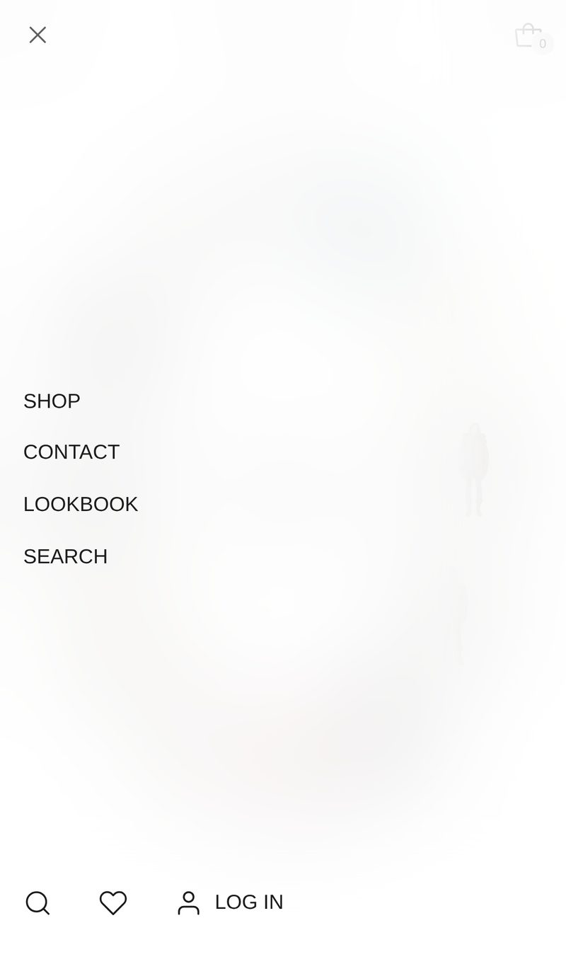
On phones the header keeps only the menu button, the logo and the bag, which shows even without the Cart block. Search and favorites move to the bottom row of Menu: Overlay, beside its Account and Country and language blocks.
Show the currency and language picker
The picker is already in your header, in Menu: Overlay on phones, and in the footer. It stays hidden until there is something to pick, so a store that sells in one country and one language never shows an empty button. To make it appear, set up a second country or a second language in the Shopify admin.
For countries and currencies:
- In the Shopify admin, go to Settings, then Markets.
- Add a market, or add more countries to the one you have, and make sure it's active.
- To show prices in each country's own currency, turn on local currencies for the market. Shoppers then see their own currency in the picker, such as "CAD $".
For languages:
- In the Shopify admin, go to Settings, then Languages.
- Add a language and Publish it. A language that isn't published doesn't count.
- Translate your products and pages with Shopify's free Translate & Adapt app. The theme's own words, such as "Add to cart", already come in Spanish and Simplified Chinese. For any other language, translate them in the same app.
Reload your store and the picker shows. It lists only what you've set up: countries alone show just the country list, languages alone show just the language list.
The Announcement bar
Show messages shows One at a time, changing every few seconds, or a Scrolling ticker. A single message sits still. Shoppers can step through messages with the arrows, which also stops the bar. Let visitors close the bar adds a ×; a closed bar stays away until the visitor closes the browser tab. A bar with only empty messages does not show.
Menu: Overlay
Menu: Overlay covers the whole screen, in its own Color scheme, with Frosted glass to show your page through it, blurred. It has three parts:
- Menu links: your menu from Theme settings, or another one with Use a different menu here. A link with links under it opens its own list, with Back and a link to the parent page.
- Content: beside the links on computers, under them on phones. Hidden until you add something, such as a Featured item (a collection or product with its picture), an image, a button or an email signup.
- Footer: the bottom row, with Account, Country and language and Social links to start.
The footer
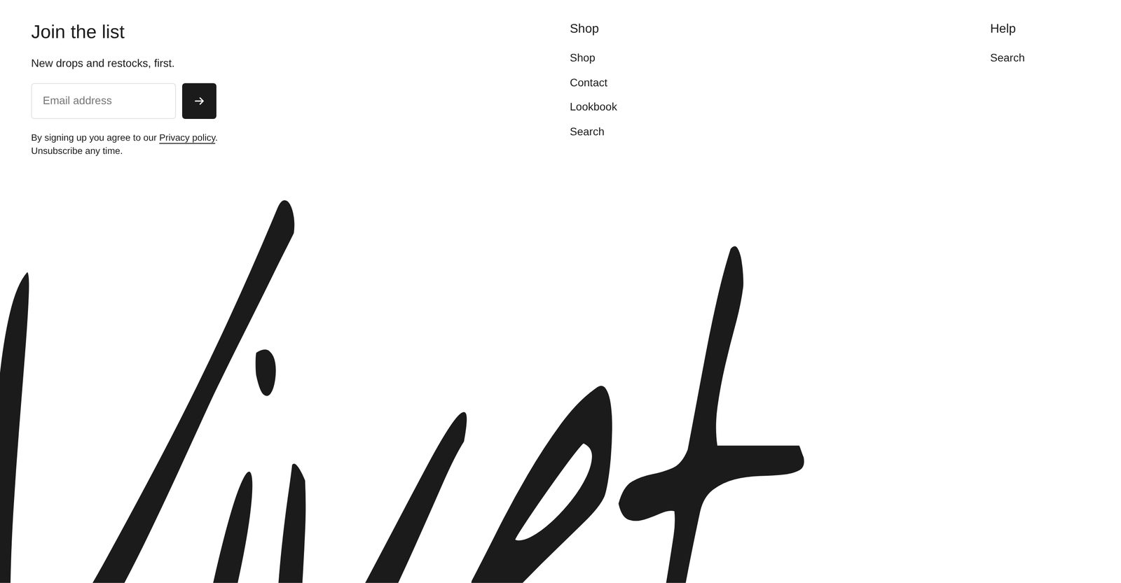
Your footer starts with two blocks:
- Footer menu: a Newsletter ("Join the list", a line of text, an email field and small print), a Shop column with your main menu, a Help column with your footer menu, and Social links. Each Menu column has a Heading and a Menu. Columns on phones sets one or two.
- Bottom edge art: huge words across the bottom with their lower part cut off by the edge. Empty, the words are your store name. Set Show to Image for a wide, short picture instead.
Add a Bottom bar for a Copyright line (empty shows © with the year and your store name) and Payment icons for the methods your store accepts. Show on homepage and Show on collection pages hide the footer there.
Social links show only the accounts you fill in. Each Social links block has its own list, so fill in the footer's and the menu's separately.
Good to know
- The password page has no header, Announcement bar, footer or Menu: Overlay.
- Footer newsletter signups go to your customers in Shopify, as the popup's do: see Collect emails with a popup.
Related
- Theme settings: Menu and Logo and icons.
- Shared settings: Color scheme, Corners, Space above and below.
- Collect emails with a popup
- Password page for drops