Editorial: Runaround
A column of paragraphs with pictures set into it, the words wrapping around each picture's outline like a magazine page.
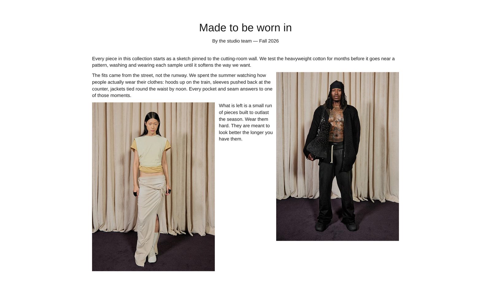
A reading column of your words, with pictures set into the text on the left or right. The lines run around each picture. With a cut-out (a picture with a see-through background) they follow its outline, the way a magazine wraps text around a model. Choose it for a longer story, such as a founder's letter or how a piece is made, when a plain block of text would feel flat.
Add it
Add it to any page except the password page, from Storytelling in "Add section". It cannot go in the header.
As first added it has a centered title ("Made to be worn in") and byline ("By the studio team — Fall 2026"), then three paragraphs with two Wrapped picture blocks between them: one on the right, one on the left. Until you choose pictures, each shows as a dashed outline of where it will sit.
What you need
- Three or more paragraphs. The wrap only shows when there are enough words beside a picture.
- Cut-out pictures (PNG or WebP with a see-through background) for words that follow an outline. Any ordinary photo works with Shape set to Circle.
Settings
Select the section itself to see these.
| Setting | What it changes | Options |
|---|---|---|
| Color scheme | Background and text. See shared settings. | Default: Scheme 1. |
| Reading width | How wide the column of words is, from about 600 px (Extra narrow) to about 1400 px (Page width). Full width uses the whole page inside its side margins. | Extra narrow, Narrow, Medium (default), Wide, Page width, Full width |
| Position | Where a column narrower than the page sits. | Left, Center (default), Right |
| Space above, Space below | See shared settings. | As added: Medium. |
Blocks
Two fixed blocks: Heading row and Text and pictures. You cannot remove them.
Heading row
What sits above the column: as added, a Heading and a Caption. You can also add Text, Image and Giant text.
| Setting | What it changes | Options |
|---|---|---|
| Alignment | Where the heading row's blocks line up. | Left (default), Center, Right. As added: Center |
| Gap | The space between them. | Small, Medium, Large (default). As added: Medium |
If you remove everything in it, the heading row takes no space.
Text and pictures
The column itself. Body font sets the font of the paragraphs: Body (default), Heading, Subheading or Accent. Lines are spread to both edges of the column, and long words break with a hyphen.
Add two kinds of block inside, in the order you want them read:
Paragraph: your words. Text, Style (Body to Heading 6, Uppercase or Custom; Font, Size and All caps appear with Custom), Color and Custom color. Paragraphs have no animation.
Wrapped picture: a picture the words wrap around. It sits beside the paragraphs that come after it in the list, so to move it, drag it up or down.
| Setting | What it changes | Options |
|---|---|---|
| Image | The picture. | |
| Shape | Around the cut-out makes the words follow the picture's outline. It needs a see-through background; on an ordinary photo the words run around a plain rectangle. Circle crops any photo into a circle the words follow. | Around the cut-out (default), Circle |
| Wrap text on side | Which side of the column the picture sits on. | Left, Right (default) |
| Size | How much of the column's width the picture takes: about 30%, 40% or 55%, with a cap in a wide column. | Small, Medium (default), Large |
| Text gap | Space between the words and the picture's edge. | Small (default), Medium, Large |
| Alt text | A description for shoppers who use a screen reader. Leave empty to use the image's own alt text. |
On phones
The column fills the screen. Pictures take at least 40% of its width, so there are still words beside them, not a thin strip.
Tips
- Put each picture just before the paragraph you want it beside, and alternate sides for a magazine rhythm.
- A tall cut-out with a clear silhouette, such as a full-length model, gives the most striking wrap.
- Medium or Narrow Reading width is easiest to read. At Page width and Full width, lines get long.
Good to know
- On shoppers' screens a Wrapped picture with no image shows a sample drawing in a dashed outline. Remove the ones you do not fill.