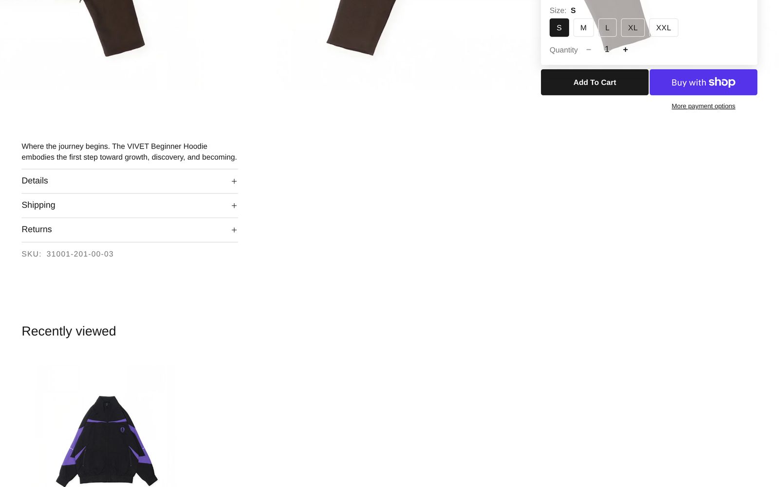
Products: Recently viewed
A row of the products this shopper opened earlier, newest first.
A row of the products a shopper has looked at before, newest first, so they can get back to something they liked. The product they are looking at now is left out. Each shopper sees their own list, and the row stays hidden until they have opened at least one other product.
Add it
Plain Jane puts it at the bottom of every product page template, under Products: Recommended. You can also add it to any other page, such as the cart or the home page: find Products: Recently viewed under Products in "Add section". A page can hold only one.
As first added it has the heading "Recently viewed" over a row of up to eight cards, four at a time.
What you need
Nothing to choose. The list builds itself as shoppers open product pages. It is kept in the shopper's browser, so it lasts between visits on the same device.
Settings
| Setting | What it changes | Options |
|---|---|---|
| Color scheme | The background, text and buttons. See shared settings. | Default: Scheme 1. |
| Width | Page width keeps the row inside your page margins. Full width lets the cards scroll out to the screen's edges, while the heading and first card stay on the page margin. | Page width, Full width. Default: Page width. |
| Space above, Space below | Empty space at the top and bottom. See shared settings. The Custom slider goes to 120 px above and 200 px below. | Default: Medium. |
| Maximum products | The most cards the row shows. | 2 to 10. Default: 8. |
| Cards per row | How many whole cards show at once on a computer. | 2 to 6. Default: 4. |
| Cards per row (mobile) | How many show at once on a phone. | 1 to 3. Default: 2. |
| Show scroll arrows | Arrows over the edges of the photos. They show on desktop only, and only when there are more products than fit. | Default: on. |
| Space below heading | The gap between the heading row and the cards. | Small, Medium, Large. Default: Medium. |
Blocks
Three blocks are always there: Heading row, Product card and Product row.
Heading row
Holds a Heading ("Recently viewed"). You can change the words, or add Text, a button or other blocks.
| Setting | What it changes | Options |
|---|---|---|
| Alignment | Where the items in the row sit. | Left, Center, Right. Default: Left. |
| Space between items | Space between the heading and anything else in the row. | Small, Medium, Large. Default: Medium. |
Product card
The look of every card. It works the same as in Products: Grid; see Product card. Here it starts with Product title, Price and Quick add & favorite.
Product row
| Setting | What it changes | Options |
|---|---|---|
| Card arrangement | In a line keeps every card level. Alternating drops every second card lower. Scattered drops cards by different amounts. | In a line, Alternating, Scattered. Default: In a line. |
| Show next card partially | A sliver of the next card shows at the edge, so shoppers can tell the row scrolls. | Default: on. |
| Space between cards | The gap between cards. | Small, Medium, Large. Default: Medium. |
On phones
Shoppers swipe the row. The arrows are hidden on touch screens.
Tips
- Give it the same settings as Products: Recommended on the product page, so the two rows look like a pair. They are built from the same parts.
- On the cart page, a recently viewed row reminds shoppers of what they left behind.
Good to know
- In the editor the row is filled with products from your store, so you can style it before you have browsed anything. Shoppers only ever see their own products.
- A first-time visitor sees nothing: the section stays hidden until there is something to show.
- If the shopper's browser blocks site storage (some private windows do), the row stays hidden.
- The last eleven products a shopper opened are remembered, so the row never shows more than ten besides the one on screen.