Slideshow: Arc
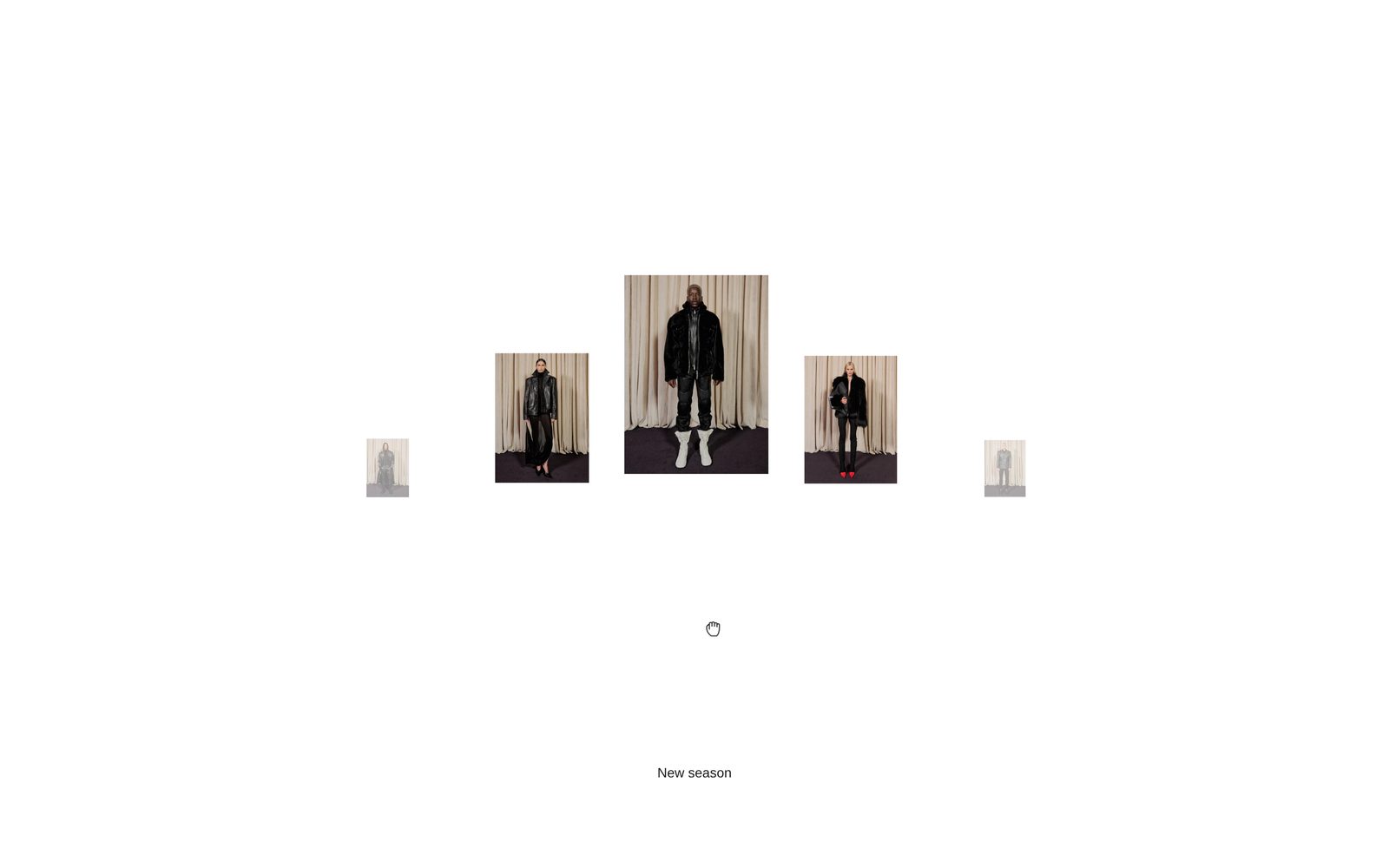
A looping row of pictures on a curve, the middle one largest, with a caption naming the picture in the middle.
A row of pictures bends along a curve: the one in the middle is the largest, and the rest get smaller and drop away to each side. The row loops forever. Visitors drag it, click a side picture to bring it to the middle, or use the arrow keys. One line of caption names whichever picture is in the middle.
Choose it to open a page with a handful of campaign pictures, or to show off products from a collection in a way that invites a drag.
Add it
It can go on any page except the password page, and not in the header or footer. In "Add section", find Slideshow: Arc under Slideshows & galleries.
As first added it fills the screen, with five slides captioned "New season", "The edit", "Studio", "Details" and "Last look". They show placeholder pictures until you add your own.
What you need
- At least three pictures, so there is always one on each side of the middle. Five or more look best.
- Tall pictures, at least 600 px wide.
- Or a collection or a list of products: their first photo is used, and the product name becomes the caption.
Settings
Select the section itself to see these.
| Setting | What it changes | Options |
|---|---|---|
| Color scheme | The background and the caption's color. See shared settings. | Default: Scheme 1. |
| Height | Full screen fills the window and puts the caption over the bottom of the slider. Fit to slides is just as tall as the pictures, with the caption under them. | Full screen, Fit to slides. Default: Full screen. |
| Space above | Empty space above the slider. Only appears when Height is Fit to slides. See shared settings. | None, Small, Medium, Large, Custom. Default here: None. |
| Space below | Empty space under the slider. | None, Small, Medium, Large, Custom. Default here: None. |
Custom space above and Custom space below (0 to 200 px) appear when you choose Custom.
Blocks
The section has two blocks that are always there: Slides and Caption. You add Slide blocks inside Slides.
Slides
Where the pictures come from and how the curve looks.
| Setting | What it changes | Options |
|---|---|---|
| Source | Your slides uses the Slide blocks you add. Collection or Products fills the row with products instead, each linking to its product page. | Your slides, Collection, Products. Default: Your slides. |
| Collection | The collection used when Source is Collection. | Any collection. |
| Number of products | How many products from the collection. Only appears when Source is Collection. | 3 to 20. Default: 9. |
| Products | The products used when Source is Products. | Up to 20. |
| Style | The shape of the row. Editorial is tall and clean, Showcase wide with a steep curve, Compact small and close together, Flat a straight row, Stacked large pictures that overlap. | Editorial, Showcase, Compact, Flat, Stacked. Default: Editorial. |
| Corners | How round the pictures' corners are. See shared settings. | None, Slight, Round. Default: None. |
| Hover effect | What a picture does when a visitor points at it on a computer: it floats up, shakes, shifts in color, or turns to its negative. Grayscale lift keeps every picture black and white until it is pointed at. | None, Float, Glitch shift, Grayscale lift, Invert flash, High contrast, Negative, Sepia burn, Shake. Default: None. |
| Drag feel | How the row glides after a drag on a computer. Smooth drifts the longest, Snappy stops quickly. | Smooth, Balanced, Snappy. Default: Balanced. |
| Show swipe hint | A small hand appears and the row rocks once, shortly after the slider comes into view, to show visitors they can drag. It stops as soon as they touch the row. | On or off. Default: on. |
Slide
One picture. Add as many as you like inside Slides. Slides only show while Source is Your slides.
| Setting | What it changes | Options |
|---|---|---|
| Image | The picture. | Tall images work best, at least 600 px wide. |
| Caption | The words shown as the caption while this slide is in the middle. | Text. |
| Link | Where the slide goes when clicked in the middle. | Any link. |
| Open link in a new tab | Opens the link in a new tab. Only appears once Link is filled in. | On or off. Default: off. |
Caption
The line naming the picture in the middle. You do not type it here: it comes from each slide's Caption, or from the product name. To remove it, hide this block.
| Setting | What it changes | Options |
|---|---|---|
| Size | Normal is your body text size. Large uses your Heading 4 size. | Normal, Large. Default: Normal. |
| Font | Which of your theme's fonts the caption uses. | Body, Subheading, Heading, Accent. Default: Body. |
| Alignment | Where the caption sits across the page. | Left, center, right. Default: center. |
On phones
Every style becomes the same simple row of small pictures, with no curve. Visitors swipe it, and the caption is always centered. Hover effects do not play.
Tips
- Pick pictures with the same shape. A wide picture next to tall ones breaks the rhythm of the curve.
- Keep captions short. A long caption is cut off with "..." rather than running onto a second line.
- On Full screen, as the first section on a page, the slider starts at the very top, under a header that sits over the page, and keeps the curve clear of it by itself. You do not need Space above.
- With Products or Collection, a picture in the middle links to its product. Clicking a side picture first brings it to the middle; a second click opens it.
Good to know
- If you choose Collection or Products but leave it empty (or the collection has no products), your own slides show instead, so the section is never blank.
- Visitors who have asked their device to reduce motion see no swipe hint, and the row jumps to each picture instead of gliding.
- The swipe hint plays once. In the editor it does not replay after each change, but turning Show swipe hint off and on again plays it.
- Keyboard visitors can tab to the row and use the left and right arrow keys, or tab through the slide links.
- Nothing moves on its own apart from the one hint.