Cart
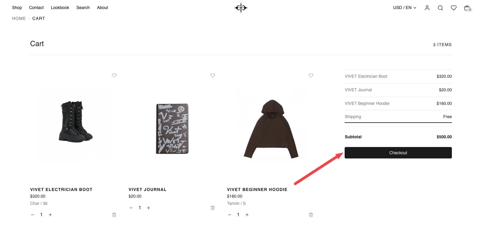
The cart page shows what a shopper has picked as a row of product photos, beside an order summary with the Checkout button.
The cart page lines up everything in the cart side by side, each as a whole photo with its name, price and quantity. Beside the row is an order summary set out like a receipt: one line per item, shipping, the subtotal and the Checkout button. Under both, a row of suggested products.
When shoppers see this page
Plain Jane also has a cart drawer, which slides out when a shopper clicks the cart icon. The drawer is on by default (Use a slide-out cart, in Theme settings under Cart). While it is on, shoppers see the drawer first and reach the cart page only from a direct link to it. Turn the drawer off and the cart icon opens this page instead.
Order note
Shoppers can leave a note with their order, such as "Gift, please leave out the receipt". In the cart drawer and on this page, an Add a note line opens a box to type in. The note is saved as they type, is still there when they come back to the cart, and shows on the order in your Shopify admin.
The note is off by default. Turn it on in Theme settings › Cart under Order note, where you can also change the words on its line. The same settings apply to the cart drawer and this page:
| Setting | What it changes | Options |
|---|---|---|
| Show order note | Shows the Add a note line in the cart drawer and on the cart page. | On or off. Default: off. |
| Note heading | The words on that line, such as "Gift message". Leave it empty to show "Add a note". Only appears when Show order note is on. | Any text. Default: empty. |
Edit it
Open the page picker at the top of the editor and choose Cart. The page has one section, called Cart. It only works on the cart page and it is already there, so you will not find it under "Add section".
To see it with products in it, add something to the cart in the editor's preview first. An empty cart shows the heading "Your cart is empty" and a "Continue shopping" button.
What you need
- Product photos of any shape. Each photo is shown whole, never cropped, in a frame slightly taller than it is wide. Photos on a plain background that matches your color scheme look as if they stand on the page.
- Shopify's product suggestions, for the "You might also like" row. Shopify chooses these, not Plain Jane. When it has none for a product, the row does not show.
Settings
Select the Cart section to see these.
Suggestions
| Setting | What it changes | Options |
|---|---|---|
| Show "You might also like" | Shows a row of products under the cart, chosen by Shopify to go with what the shopper has picked. Also turns the row under an empty cart on or off. | On or off. Default: on. |
| Products for an empty cart | The products shown in that row while the cart is empty. Leave it empty to show products from your whole catalog. | Any collection. Default: none chosen. |
Appearance
| Setting | What it changes | Options |
|---|---|---|
| Color scheme | The background, text and line colors of the whole page. See shared settings. | Any of your schemes. Default: Scheme 1. |
| Width | Page width keeps the cart as wide as the rest of your pages. Full width lets it run to the edges of the screen, less the usual side margin. The extra room goes to the product photos; the order summary stays the same size. | Page width, Full width. Default: Page width. |
Padding
| Setting | What it changes | Options |
|---|---|---|
| Space above | Empty space above the "Cart" title. See shared settings. | None, Small, Medium, Large, Custom. Default: Custom. |
| Custom space above | The exact space. Only appears when Space above is Custom. | 0 to 200 px. Default: 48 px. |
| Space below | Empty space under the last row. | None, Small, Medium, Large, Custom. Default: Custom. |
| Custom space below | The exact space. Only appears when Space below is Custom. | 0 to 200 px. Default: 96 px. |
Blocks
The section has two blocks, Cart items and Cart summary. They are always there. You cannot remove them, add a second one or swap their order.
Cart items
The row of products. Each one shows its photo, name, price, the chosen option (size, color), and a quantity control with a remove button. A discounted item shows the old price crossed out and the name of the discount.
| Setting | What it changes | Options |
|---|---|---|
| Items in a row | How many products fit across the row on desktop. With more items in the cart than this, the row scrolls sideways and the next item peeks in at the edge. It never starts a second row. | 2, 3 or 4. Default: 3. |
Cart summary
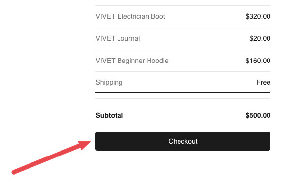
The receipt: a line for each item, a line for each discount on the whole cart, a Shipping line that reads "At checkout", then the subtotal, the Checkout button and the payment extras below.
| Setting | What it changes | Options |
|---|---|---|
| Show offer countdown | Shows the cart drawer's countdown as one more line in the summary. You turn the countdown on, set how long it runs and change its words in Theme settings › Cart. This setting only hides it on the cart page. | On or off. Default: on. |
| Show express checkout buttons | Shows buttons such as Shop Pay, Apple Pay and PayPal under Checkout, when your store offers them. You set them up in Settings > Payments in your Shopify admin. | On or off. Default: on. |
| Show accepted payment methods | Shows an icon for each payment method your store accepts, under the Checkout button. | On or off. Default: on. |
| Black and white icons | Shows those icons in grey instead of each brand's colors. Only appears when Show accepted payment methods is on. | On or off. Default: on. |
You can add app blocks to Cart summary. They appear between the subtotal and the Checkout button.
On phones
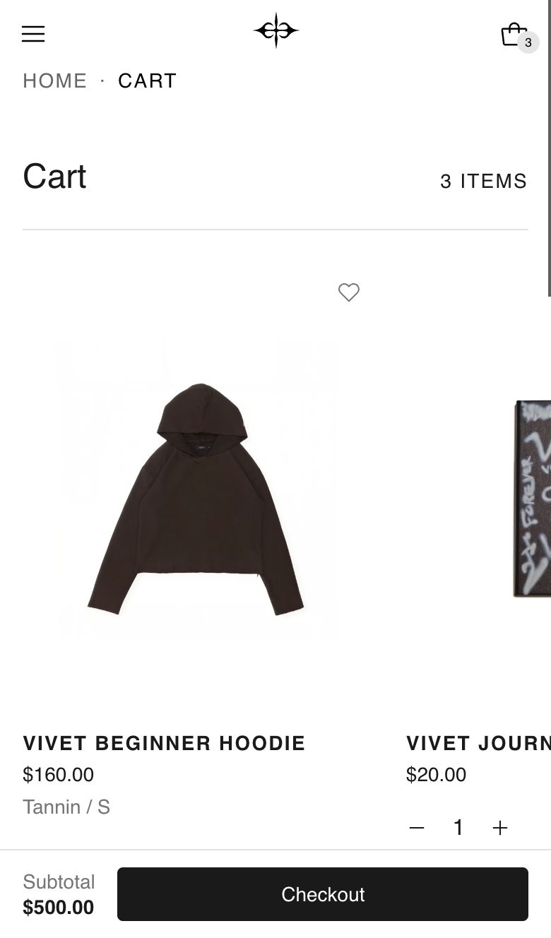
The products become a row to swipe, with one in view and the start of the next. The order summary follows underneath. A bar with the subtotal and the Checkout button stays at the bottom of the screen for as long as the cart is in view, so the way to pay is always there. The countdown is not repeated in that bar.
Tips
- Set Items in a row to match how most of your orders look. If shoppers usually buy one or two things, 2 shows them large. Use 4 if baskets are bigger.
- Choose a collection for Products for an empty cart, such as new arrivals or best sellers. An empty cart is a visitor who has not found something yet.
- Leave Black and white icons on if you want the payment icons to sit quietly under the button. Turn it off to show them in their brand colors.
- With Width on Full width, try Items in a row at 4. The photos take the extra room.
Good to know
- Changes save by themselves. Plus, minus, a typed quantity and remove all update the page without reloading it. Setting a quantity to 0 removes the item.
- Not enough stock. If a shopper asks for more than you have, the quantity goes back to what is available and a message under that item says so.
- The order summary stays in view on desktop while the shopper scrolls past the products and suggestions.
- Suggestions follow the cart. They are based on the last item in the row and leave out anything already in the cart. Up to 8 show. Products without a photo are skipped.
- In the editor, the suggestions row shows products from your catalog as a stand-in when Shopify has no suggestions yet, so you can see how it looks. On the live store the row stays hidden until Shopify has something to suggest.
- Products for an empty cart does nothing while Show "You might also like" is off. One switch controls both rows.
- The countdown restarts. It is kept in each shopper's browser and carries across pages and visits. When it runs out, "Offer expired!" shows for a few seconds and a new countdown begins.
- The heart on each item follows your Favorites settings in Theme settings: Show favorite button on desktop and Show favorite button on mobile.
- Gift cards show who they are for, when the shopper has filled that in.
- Shipping is always shown as "At checkout". The cart page does not estimate it.
Related
- Shared settings: Space above, Space below and Color scheme.
- Page not found: Crowd
- Theme settings: Favorites