Images: Full width
One photo that runs from one side of the screen to the other.
One photo across the whole screen, with no margin at the sides and no space above or below. Use it for a single strong picture between other sections, such as a campaign shot or a lookbook opener.
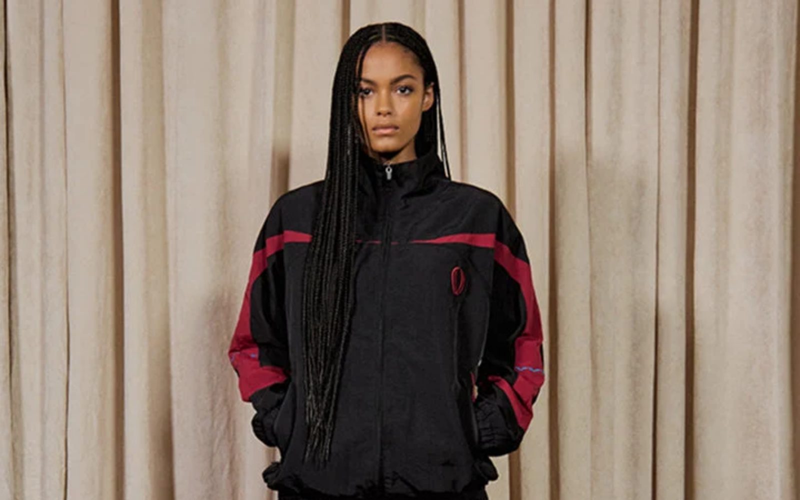
Add it
It can go on any page. In "Add section", find Images: Full width under Images. It is a ready-made Section, so it has all of that section's settings.
The blocks it starts with
- Image, set to Width Full width and Shape Original, so the whole photo shows at its own proportions, as tall as it needs to be.
Choose your photo in the Image block. To crop it to a set shape, change Shape to Portrait, Square or Landscape.
As first added
- Width: Edge to edge, so the photo meets the sides of the screen.
- Space above and Space below: None. Gap: None.
Tips
- Use a wide (landscape) photo. A tall photo at full width fills more than a whole screen.
- With Shape at Original, the photo's height follows the photo. If you swap it for a different photo later, the section changes height with it.
- To leave a margin at the sides, set the section's Width to Full width.
- Words added to this section touch the edges of the screen too. For a photo with words on it, a hero section is a better fit.
Settings
All settings are the general section's: see Section.