Hero: Classic
A large photo or video, or two side by side, with your heading, text and button on top.
The plain hero: one photo or video fills the section, or two sit side by side, each taking half. Your heading, text and button sit on top, where you place them. You can make the whole photo a link and show a short label that follows the mouse.
Choose it when you want a strong first picture and nothing moving. For a photo with movement, look at Hero: Depth.
Add it
It can go on any page, including the password page. In "Add section", find Hero: Classic under Hero. As the first section on a page it runs up under your header, and your words start below the header.
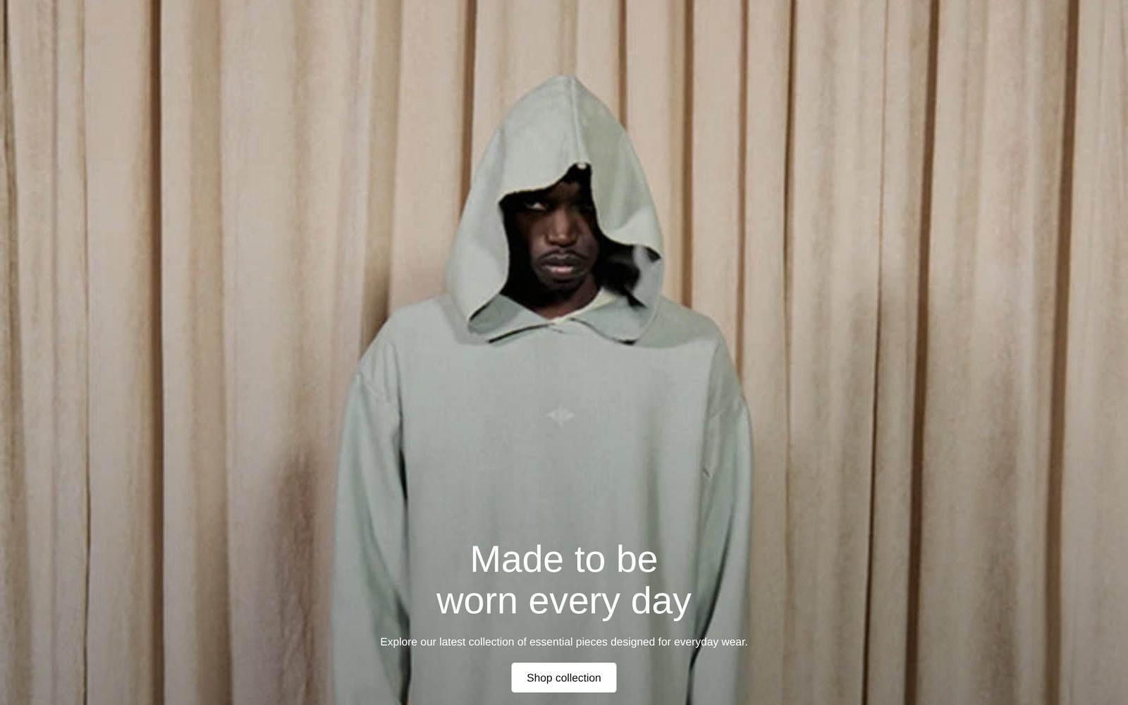
As first added it fills the screen with a stand-in picture, the words "Made to be worn every day" in the Heading 1 style, a line of text and a "Shop collection" button leading to all your products, at the bottom center. It has Small space below.
What you need
- One wide photo or a short video. It is cropped to fill the section, so set a focal point on the photo in Shopify to choose what stays in view.
- Or two photos or videos to show side by side, such as two looks from one shoot.
- Optional phone versions, if your desktop photo is too wide to crop well on a phone.
Settings
| Setting | What it changes | Options |
|---|---|---|
| Color scheme | The background, the words and the button colors. See shared settings. | Default: Scheme 2. |
| Content width | How close your words can come to the screen's edges on desktop. Page width keeps them in line with the rest of your page; Full width brings them closer. The photo always fills the full width. | Page width, Full width. Default: Page width. |
| Height | How tall the section is: Small 40% of the screen, Medium 60%, Large 80%, Full screen 100%. | Small, Medium, Large, Full screen, Custom. Default: Full screen. |
| Custom height | The height as a share of the screen. Only appears when Height is Custom. | 10 to 100%. Default: 60%. |
| Space above, Space below | Space at the top and bottom, in the section's background color. See shared settings. | None, Small, Medium, Large, Custom (0 to 200 px). As added: None above, Small below. |
Media
| Setting | What it changes | Options |
|---|---|---|
| Type, Image or Video (under "Media — slot 1") | The main photo or video. Videos play silently on a loop. | Image, Video. Default: Image. |
| Type, Image or Video (under "Media — slot 2 (optional)") | A second photo or video. With one chosen, the section splits in two halves. | Image, Video. Default: Image, nothing chosen. |
| Stack media on mobile | With two photos or videos, on: phones show them one above the other. Off: side by side. | Default: on. |
| Use different media on mobile | Shows other photos or videos on phones. Two more groups appear, "Mobile media — slot 1" and "Mobile media — slot 2", each with Type, Image and Video. | Default: off. |
Section link
| Setting | What it changes | Options |
|---|---|---|
| Link | Makes the whole section clickable. Buttons on top still go to their own links. | Any link. |
| Label that follows the mouse | A short word or two that follows the mouse over the photo. On phones it sits at the bottom and gently pulses. Only appears once Link is set. | Any text. |
| Label color | Contrasts with the photo flips light or dark against the photo; Color scheme text uses your scheme's text color. Only appears once the label has text. | Default: Contrasts with the photo. |
| Open in new tab | Opens the link in a new browser tab. Only appears once Link is set. | Default: off. |
Layout and Overlay
| Setting | What it changes | Options |
|---|---|---|
| Content position | Where your words and buttons sit. | Nine places. Default: Bottom center. |
| Gap | The space between your blocks. | 0 to 100 px. Default: 16 px. |
| Strength | Darkens the photo so your words stay readable. | None, Light, Medium, Dark. Default: Medium. |
| Overlay color | The color of the darkening. Only appears when Strength is not None. | Default: black. |
| Overlay style | Behind text darkens the part your words sit on; Whole photo darkens all of it. Only appears when Strength is not None. | Default: Behind text. |
Blocks
You can add Text, Giant text, Button, Image, Spacer, Group, Plain Jane's other general blocks and app blocks. They stack in the place Content position sets, and you can reorder or hide each one. As added: a heading (a Text block in the Heading 1 style), a Text block for the line under it and a Button.
On phones
The section keeps its height and crops the photo from the sides. Two photos stack unless Stack media on mobile is off. If you chose phone media, phones show only that.
Tips
- If you use a label that follows the mouse, keep it to one or two words, such as "Shop".
- With two photos side by side, put your words at the bottom center so they sit across the seam.
- If you tick Use different media on mobile, choose at least one phone photo; until you do, phones show the desktop media.
Good to know
- Videos play while on screen. They pause while a visitor uses the keyboard inside the section, or after a tap or click, and there is no pause button.
- Visitors who have asked their device to reduce motion see a video's first frame, and the label does not pulse.
- In the editor the label stays at the bottom of the photo so you can read it while editing. It follows the mouse only on your live store.