Products: Grid
A heading and a View all button above a grid of product cards, from one collection or from products you pick.
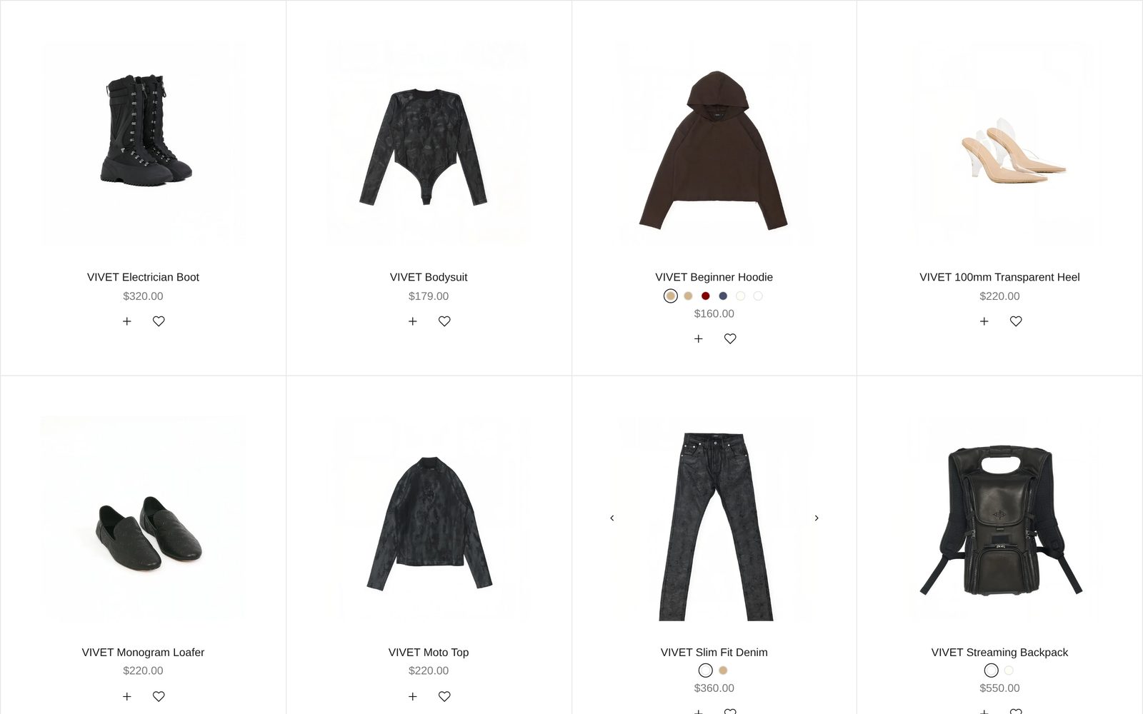
A grid of your products, with a heading and a View all button above it. Each card shows the product's photo, name, color swatches, price and quick add buttons. Shoppers point at a card to see its next photo and click it to open the product.
Choose it to show a whole collection at a glance. If you would rather show one line of products that shoppers scroll sideways, use Products: Row.
Add it
It can go on any page except the password page. Find Products: Grid under Products in "Add section". Plain Jane puts one on the home page of a new store.
As first added it shows up to eight products from your whole catalog, four to a row, with the heading on the left and a View all button on the right.
What you need
- A collection with at least four products, or a few products to pick by hand.
- Product photos of the same shape look tidiest. Cards are square unless you change Image shape.
- A second photo on each product, so pointing at a card shows something new.
Settings
| Setting | What it changes | Options |
|---|---|---|
| Color scheme | The background, text, buttons and lines. See shared settings. | Default: Scheme 1. |
| Width | Page width keeps the grid inside your page margins. Full width runs the cards to the screen's edges; the heading still lines up with the page margin. | Page width, Full width. Default: Page width. |
| Space above, Space below | Empty space at the top and bottom. See shared settings. The Custom slider here goes up to 120 px. | Default: Medium. |
Products
| Setting | What it changes | Options |
|---|---|---|
| Show products from | Where the products come from. | A collection, Products I pick. Default: A collection. |
| Collection | The collection to show. Shoppers who click a product stay inside this collection while they browse. With none chosen, your whole catalog shows. | Any collection. |
| Maximum products | How many products show. Only appears with A collection. | 2 to 24. Default: 8. |
| Products to show | The products to show, in the order you drag them into. Used with Products I pick. The heading and View all then point to all your products. | Up to 24 products. |
Collection and Products to show both stay in the panel whichever source you choose. Only the one that matches Show products from is used.
Layout
| Setting | What it changes | Options |
|---|---|---|
| Products per row (desktop) | Cards side by side on a computer. | 1 to 6. Default: 4. |
| Products per row (mobile) | Cards side by side on a phone. | 1 to 3. Default: 2. |
| Grid style | Ruled draws thin lines between the products and adds space around each one. | Standard, Ruled (lines between products). Default: Standard. |
| Space between cards | The gap between cards. Hidden when Grid style is Ruled. | None, Small, Medium, Large. Default: Medium. |
| Space below heading | The gap between the heading row and the grid. | Small, Medium, Large. Default: Medium. |
Blocks
Heading with button
The row above the grid. As added, it holds a Collection title block, which shows the collection's name and changes by itself when you pick another collection, and a View all button. Left without a link, the button opens the collection you picked (or all products).
| Setting | What it changes | Options |
|---|---|---|
| Position | Where the heading and button sit. Spread across the row puts the heading on the left and the button on the far right, on phones too. | Left, Center, Right, Spread across the row. Default here: Spread across the row. |
| Space between | The gap between the items in the row. | None, Small, Medium, Large, Extra large. Default: Medium. |
To write your own heading instead of the collection's name, remove Collection title and add a Heading block. You can also add Text, more buttons and other blocks to this row, or remove the button.
Product card
One card is set up once and used for every product in the grid. Changes here change every card. The same card is used in Products: Row, Products: Recently viewed, Products: Recommended and Products: Complementary; each section has its own copy, so a change in one does not reach the others.
| Setting | What it changes | Options |
|---|---|---|
| Show product number | A small number (01, 02, 03…) above each card. | On or off. Default: off. |
| Pad with leading zero | 01 instead of 1. Appears when numbers are on. | Default: on. |
| Number suffix | What follows the number. Appears when numbers are on. | None (01), Dot (01.), Slash (01/). Default: Dot. |
| Gap between details | Space between the name, price and other details. | None, Small, Medium, Large. Default: Medium. |
| Details alignment | Lines the details up under the photo. | Left, Center, Right. Default: Center. |
| Details position | Where the details sit when cards in a row have different heights. | Top, Bottom. Default: Top. |
Product media is the photo. It is always there.
| Setting | What it changes | Options |
|---|---|---|
| Make all items the same size | On: every photo is cropped or fitted to one shape. Off: each card takes the shape of its product's first photo. | Default: on. |
| Image shape | The shape of every photo. Appears when the setting above is on. | Portrait, Square, Landscape, Tall portrait, Wide. Default: Square. |
| Image fit | Show whole image keeps the full photo inside the shape. Fill the frame crops it to fill the shape. | Default: Show whole image. |
| Auto-rotate product tag | Products with this tag cycle through their photos while on screen. Add the tag to the product in Shopify admin. | Default: auto-rotate. |
| Rotation speed | How long each photo shows. Appears when a tag is set. | Slow, Medium, Fast. Default: Medium. |
| Show pre-order badge, Show sold-out badge, Show sale badge | A badge on the photo. Pre-order shows on products tagged pre-order. Sold out and sale come from the product's stock and compare-at price. Only one badge shows at a time, in that order. | Each on by default. |
Badge colors, position and corners are set in Theme settings, under Badges.
The details under the photo are blocks you can add, remove and reorder:
| Block | What it shows | Settings |
|---|---|---|
| Product title | The product's name. | Style (Body, Uppercase, Heading 6, Heading 5, Heading 4; default Body), Animation (None, Scramble: the letters shuffle into the name as the card comes into view). |
| Color swatches | A chip for each color. Choosing one shows that color's photo. See color swatches. | Corners (None, Slight, Round; default Slight). |
| Price | The price. | Show "From" on ranged prices (on), Show compare-at price when on sale (on), Show currency code (off). |
| Review stars | The star rating saved by your reviews app (Judge.me, Okendo, Yotpo and others). Products without reviews show nothing. Not added here at first. | Style (Filled stars, Outlined stars, One star and the score), Show number of reviews (on), Color (Text, Accent). |
| Quick add & favorite | A + button that adds the product to the cart (or opens its options) and a heart that saves it. | Use different settings for these cards: off, the buttons follow your store-wide choices in Theme settings. On, five switches appear: Show quick add button on desktop, Always show on desktop, Show quick add button on mobile, Show favorite button on desktop, Show favorite button on mobile. |
| Text | Any words you write, the same on every card. | The full Text block settings. |
What the photos do
- Two photos: pointing at the card shows the second.
- Three or more: small arrows appear on the photo on a computer, to step through up to five photos.
- A video as the product's first media: it plays silently on repeat while the card is on screen, and holds still while the pointer rests on it.
On phones
Cards sit two to a row unless you change Products per row (mobile). Photo arrows do not show on phones, and the heading row stacks unless Position is Spread across the row.
Good to know
- A collection with no products, or an empty Products to show, hides the section from shoppers. In the editor you see grey sample cards so you can style the card first.
- Cards rise gently into view as the page scrolls. Visitors who ask their device to reduce motion see them still, and so do videos and auto-rotating photos.