Products: Row
One line of product cards that shoppers scroll sideways, from a collection or from products you pick.
A heading above a single line of product cards. Shoppers scroll the line sideways with the arrows, a swipe, or by dragging it with the mouse. The cards are the same product cards as in Products: Grid: photo, name, price and quick add buttons.
Choose it when you want to show a handful of products without taking up much of the page. To show a whole collection at once, use Products: Grid.
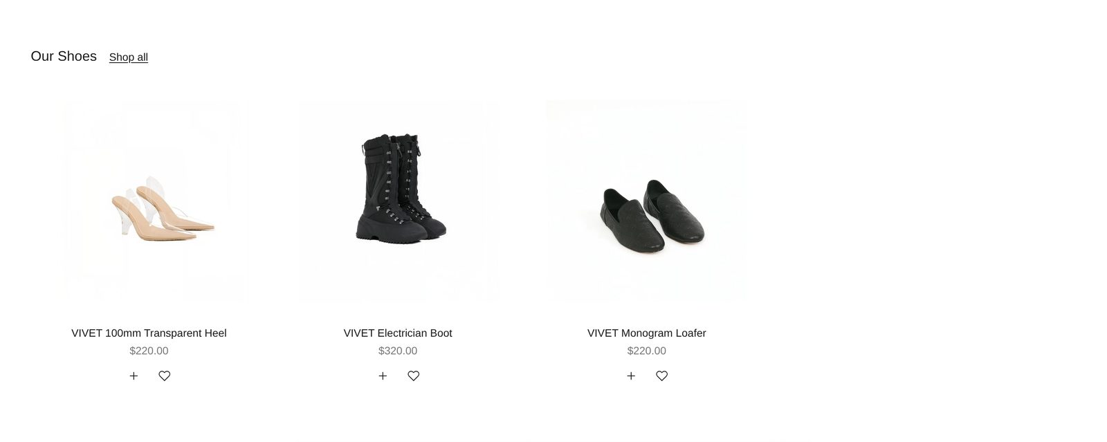
Add it
It can go on any page. Find Products: Row under Products in "Add section".
As first added it shows up to eight products from your whole catalog, four at a time with a sliver of the next one, under the heading "Shop the collection" and a Shop all link to all your products.
What you need
- A collection, or a few products to pick by hand. More products than fit on one screen make the row scroll.
- A second photo on each product, so pointing at a card shows something new.
Settings
| Setting | What it changes | Options |
|---|---|---|
| Color scheme | The background, text and buttons. See shared settings. | Default: Scheme 1. |
| Width | Page width keeps the row inside your page margins. Full width lets the cards scroll out to the screen's edges, while the heading and first card stay on the page margin. | Page width, Full width. Default: Page width. |
| Space above, Space below | Empty space at the top and bottom. See shared settings. The Custom slider goes up to 120 px. | Default: Medium. |
Products
| Setting | What it changes | Options |
|---|---|---|
| Show products from | Where the products come from. | A collection, Products I pick. Default: A collection. |
| Collection | The collection to show. Shoppers who click a product stay inside this collection while they browse. | Any collection. |
| Maximum products | How many cards the row holds. Only appears with A collection. | 2 to 16. Default: 8. |
| Products to show | The products to show, in the order you drag them into. Used with Products I pick. | Up to 12 products. |
Until you choose a collection or products, the row shows products from your whole catalog, in the editor and on your store.
Layout
| Setting | What it changes | Options |
|---|---|---|
| Cards per row | How many whole cards show at once on a computer. | 2 to 6. Default: 4. |
| Cards per row (mobile) | How many show at once on a phone. | 1 to 3. Default: 2. |
| Show scroll arrows | Arrows over the left and right edges of the photos. They show on desktop only, and only when there are more products than fit. | Default: on. |
| Space below heading | The gap between the heading row and the cards. | Small, Medium, Large. Default: Medium. |
Blocks
The section has three blocks that are always there: Heading row, Cards and Product card.
Heading row
Holds a Heading ("Shop the collection") and a Button in the Link style ("Shop all"). You can add Text, a Decorative heading, more buttons and other blocks, or remove the ones there.
| Setting | What it changes | Options |
|---|---|---|
| Alignment | Where the items in the row sit. | Left, Center, Right. Default: Left. |
| Space between items | Space between the heading and anything else in the row. | Small, Medium, Large. Default: Medium. |
Cards
How the cards sit in the row.
| Setting | What it changes | Options |
|---|---|---|
| Card arrangement | In a line keeps every card level. Alternating drops every second card lower. Scattered drops cards by different amounts for a looser look. | In a line, Alternating, Scattered. Default: In a line. |
| Show next card partially | A sliver of the next card shows at the edge, so shoppers can tell the row scrolls. | Default: on. |
| Space between cards | The gap between cards. | Small, Medium, Large. Default: Medium. |
Product card
The look of every card: photo shape, badges, and the details under the photo. It works the same as in Products: Grid; see Product card. Here it starts with Product title, Price and Quick add & favorite. Add Color swatches or Review stars if you want them.
On phones
Shoppers swipe the row. The arrows are hidden on phones and on any touch screen; the peeking card shows there is more.
Tips
- Set Cards per row one lower than in a grid elsewhere on the page. Larger cards suit a row that scrolls.
- Alternating or Scattered works best with photos on a plain background, where the uneven line reads as a choice.
- Change the heading's words when you pick a collection. The heading does not follow the collection's name.
Good to know
- An empty collection hides the section from shoppers. In the editor you see grey sample cards.
- With a mouse, shoppers can grab the row and drag it, with or without arrows.