Collections: Row
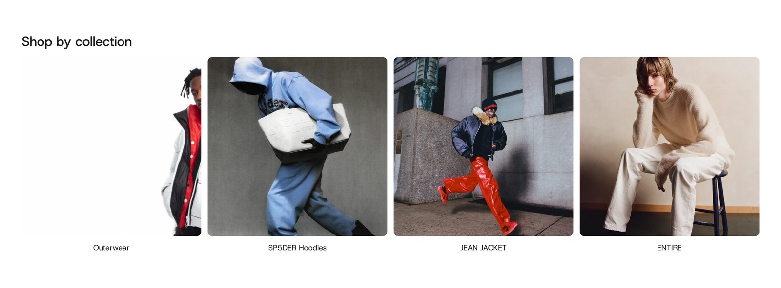
A row of collection pictures with their names underneath, each one opening its collection.
A heading above a row of collection cards: a picture with the collection's name centered under it. Clicking a card opens the collection. When there are more cards than fit, shoppers scroll the row sideways.
Choose it for a quick "Shop by collection" strip. For big pictures with words laid over them, use Collections: Tiles. For a page that lists every collection, use Collections: List.
Add it
It can go on any page. Find Collections: Row under Collections in "Add section".
As first added it has the heading "Shop by collection" and ten empty cards, which show as grey drawings in the editor only. Until you give the cards collections, shoppers see nothing: the whole section stays hidden on your store.
What you need
- The collections to show. Each collection's own image is used. A collection without one uses its first product's photo.
- Pictures of the same kind: all cutouts on plain backgrounds, or all full photos. A mix looks uneven.
Settings
| Setting | What it changes | Options |
|---|---|---|
| Color scheme | The background and text. See shared settings. | Default: Scheme 1. |
| Corners | How round the pictures' corners are. See shared settings. | None, Slight, Round. Default: Slight. |
| Space above, Space below | Empty space at the top and bottom. See shared settings. The Custom slider goes up to 120 px. | Default: Medium. |
| Show scroll arrows | Arrows at the row's edges, level with the middle of the pictures. They show on computers with a mouse, and only when the row is longer than the screen. Without them, shoppers drag the row with the mouse. | Default: on. |
Blocks
Heading row
Holds a Heading ("Shop by collection"). You can add a Description, a Button (for example "View all"), Text or other blocks, or remove them all to show just the cards.
| Setting | What it changes | Options |
|---|---|---|
| Alignment | Where the heading row sits. | Left, Center. Default: Left. |
Cards
The look of the whole row, shared by every card so they all match.
| Setting | What it changes | Options |
|---|---|---|
| Collections | The quick way: pick collections and each becomes a card with its own picture and name, in your order. While any are picked, the Collection card blocks below are not shown. | Up to 20 collections. |
| Card size | The smallest a card gets before the row starts to scroll. With few cards, they grow to share the width. | Small, Medium, Large. Default: Medium. |
| Image shape | The shape of every picture. | Portrait, Square. Default: Square. |
| Image fit | Fill the frame crops each picture so every card matches. Show whole image suits cutout photos on a plain background. | Default: Fill the frame. |
| Title style | The size of the names under the pictures. | Paragraph, Heading 6, Heading 5. Default: Paragraph. |
| Space between cards | The gap between cards. | 0 to 48 px. Default: 12 px. |
Collection card
The other way: leave Collections empty and set each card yourself. Add, remove and drag cards to change the order.
| Setting | What it changes | Options |
|---|---|---|
| Collection | The collection the card opens. Without one, the card cannot be clicked. | Any collection. |
| Image | A picture for this card. Leave empty to use the collection's image. | Any image. |
| Title | The words under the picture. Leave empty to use the collection's name. | Text. |
A card with neither a collection nor an image shows only in the editor.
On phones
The row starts at the page margin and runs off the right edge. Shoppers swipe it. The arrows are hidden, and the heading row stacks if it holds more than one block.
Tips
- Use Collections for a fast setup. Switch to Collection card blocks when you want a different picture or a shorter name for one collection.
- With cutout product photos, choose Show whole image so nothing is cropped.