Editorial: Script
A big handwritten phrase runs across the section, behind or over a centered column of photos and words.
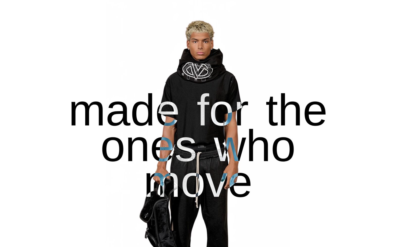
One large phrase in your accent font fills the section, with a narrow column of blocks centered on it: a cut-out photo, a caption, a heading, a button. The phrase can sit behind the column or over it, tilt, and draw itself on as it scrolls into view. Choose it for a campaign line or a brand statement that should feel written by hand.
Add it
Add it to any page except the password page, from Storytelling in "Add section". It cannot go in the header or footer.
As first added it is as tall as the screen, with the phrase "Made for the ones who move different" behind one Image block named Cut-out photo. When it is the first section on a page, it runs up under your header; the blocks still start below the header.
What you need
- A short phrase: three to eight words read best.
- For the brush look, a handwritten accent font. Set it in Theme settings, under typography.
- A photo on a see-through background (a cut-out) if you want the phrase to show around the product.
Settings
Select the section itself to see these.
| Setting | What it changes | Options |
|---|---|---|
| Color scheme | Background, the column's text, and the phrase's color (the scheme's link color, unless you set Script color). See shared settings. | Default: Scheme 1. |
| Height | How tall the section is, as a share of the screen. Fit to content is only as tall as what is inside. Either way it grows if a long phrase needs more room. | 100% (default), 75%, 50%, Fit to content |
Script
| Setting | What it changes | Options |
|---|---|---|
| Text | The phrase. Leave it empty for no phrase. | Default: "Made for the ones who move different" |
| Font | Which of your theme fonts the phrase uses. | Accent (default), Heading, Subheading |
| Opacity | How see-through the phrase is. | 10 to 100%. Default: 100% |
| Size | How big the phrase is. A long word shrinks by itself so it is never cut off. | Small, Medium, Large (default) |
| Line spacing | The space between the phrase's lines. | Tight (default), Normal, Relaxed |
| Tilt | Turns the phrase. | -15 to 15°. Default: 0° |
| Placement | Behind your content puts the phrase under the column. On top of your content puts it over, which can hide your text: pick a lighter scheme or lower Opacity if it does. | Behind your content (default), On top of your content |
| Stay readable over photos | Appears with On top of your content. The phrase turns light over dark parts of a photo and dark over light parts. It replaces Script color while on. | On or off. Default: off |
| Script color | A color of your own for the phrase. Leave it empty to use the scheme's link color. |
Animation
| Setting | What it changes | Options |
|---|---|---|
| Animation | How the phrase appears once it scrolls into view. Draw on reveals it line by line, like a hand writing it. | None (default), Fade in, Slide up, Draw on |
| Speed | Appears when an animation is chosen. | Slow, Medium (default), Fast |
Space above and Space below start at Medium. See shared settings.
Blocks
The column takes any block, stacked in the center. As added it holds one Image block named Cut-out photo. Two blocks belong to this section:
- Caption: a short line of text, set to the Uppercase style. It has the same settings as the Text block: the words, width and line length, style and color, background, spacing above and below, and an animation.
- Divider: a thin line. Width (10 to 100%), Thickness (1 to 5 px) and Opacity (5 to 100%, default 15%).
Add a Heading and a Button to turn it into a campaign banner.
On phones
The phrase is drawn larger compared with the screen, so it still reads as big. The column stays centered.
Tips
- With a cut-out photo and Placement on Behind your content, the phrase shows around the product's edges.
- Lower Opacity to 20 to 40% to turn the phrase into a background texture.
- A slight Tilt (-6 to 6°) looks hand-placed. More can push a long phrase past the edges.
- In the editor, changing a color or tilt shows the phrase finished at once. Change Animation or Speed to watch it play again.
Good to know
- Screen readers read the phrase once, as plain text.
- Visitors who reduce motion on their device see the phrase appear at once, with no animation.