Collection page
The page that lists a collection's products, with filters, sorting and product cards, and the page that lists all your collections.
A collection page shows one collection: a picture, title and description, then its products, which shoppers can filter, sort and add to the cart. The page that lists all your collections is covered at the end.
When shoppers see this page
Whenever they open a collection. Every collection shares this page, so a change here shows on all of them. The words and picture come from each collection in your Shopify admin.
Edit it
Open a collection page in the editor. It starts with two sections:
- Collection page: Header: the picture, title and description.
- Collection page: Grid: the filter bar and the products.
To swap the grid for Collection page: Classic (a menu column beside the products), add Classic, then remove the grid. While both are on the page, the editor outlines the extra one and shows a note.
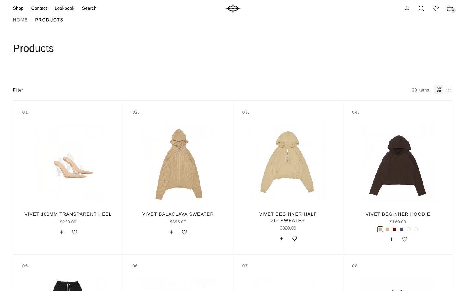
Header
The picture is the collection's own image, or the Image you pick in the Header image block for collections without one. (For a different header picture per collection, the block's help text explains the custom field to add.) With no picture, the title moves up. As the page scrolls, the picture drifts and zooms slowly, unless the shopper has turned on Reduce Motion.
| Setting | What it changes | Options |
|---|---|---|
| Height (Header image block) | How much of the screen the picture fills. | Small (half the screen, as installed), Medium, Large |
| Image position (Header image block) | Which part of the picture stays in view when it is cropped. A picture with a focal point set in Shopify uses that instead. | Top (default), Center, Bottom |
| Direction | Title and description side by side, or one above the other. | Side by side, Stacked (as installed) |
Hide the Header image block to drop the picture on every collection. You can add blocks such as Button or Text beside the title.
Grid
| Setting | What it changes | Options |
|---|---|---|
| Grid style | Ruled draws thin lines between products. | Standard, Ruled (as installed) |
| Products per row (desktop) | Cards across on computers. | 2 to 8. Default: 4 |
| Products per row (mobile) | Cards across on phones. | 1, 2 (default), 3 |
| Auto-load products as you scroll | On, more products load as shoppers reach the bottom. Off, numbered page links show instead, and Products per page appears. | On (default) |
Space above, Space below and Color scheme work as in shared settings, except that the Custom slider for Space above stops at 120 px.
Filters and sorting
Shoppers press Filter above the products. A panel opens at the side with Sort by, then every filter. Products update as soon as a shopper ticks something, and "Show 24 items" closes the panel. Each filter in use shows as a tag under the bar, with a cross to remove it.
You choose the filters (Color, Size, Price, availability) in your Shopify admin with the Search & Discovery app. Plain Jane lays them out: colors with a color strip, sizes as tiles, price as a slider, availability as one "In stock" box.
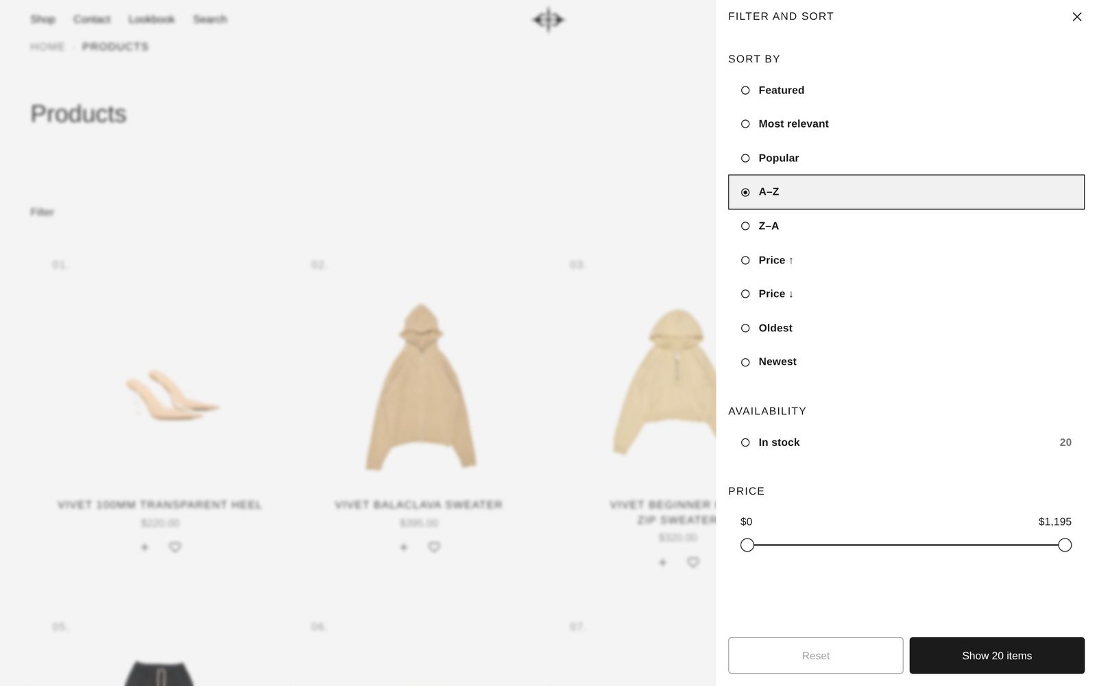
Select the Filters & sort block to change these:
| Setting | What it changes | Default |
|---|---|---|
| Enable filtering | Shows your filters in the panel. | On |
| Enable sorting | Shows Sort by: Featured, Popular, A–Z, Z–A, Price ↑, Price ↓, Oldest, Newest. | On |
| Show count beside each filter value | The number of products beside each choice. | On, as installed |
| Show result total | "24 items" at the right of the bar. | On |
| Let shoppers change card size | Two small grid icons beside the total. The second packs many smaller cards into each row. Computers only; the choice holds for the rest of the visit. | On |
Product cards
Select the Product card block. Its title, price, swatches and buttons are blocks you can reorder or remove, and you can add Review stars (from your reviews app) or Text.
- Photos. Image shape and Image fit in Product media set the frame. Two photos swap when a shopper points at the card; three or more get arrows. Tag a product
auto-rotateand its photos cycle by themselves. - Badges. Turn Sale, Sold out and Pre-order on or off in Product media. Their look is in Theme settings, Badges.
- Numbers. Show product number (on as installed) puts 01., 02., 03. above each card.
- Quick add and favorites. The + and heart follow Theme settings, Quick add and Favorites, unless you tick Use different settings for these cards in the Quick add & favorite block.
- Color swatches. One small circle per color; clicking one switches the photo. See Set up color swatches.
On phones
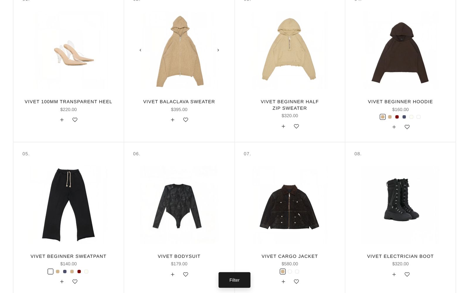
Cards sit two across. Once a shopper scrolls past the filter bar, a Filter button stays at the bottom of the screen (on computers too), and the panel opens full screen.
Classic
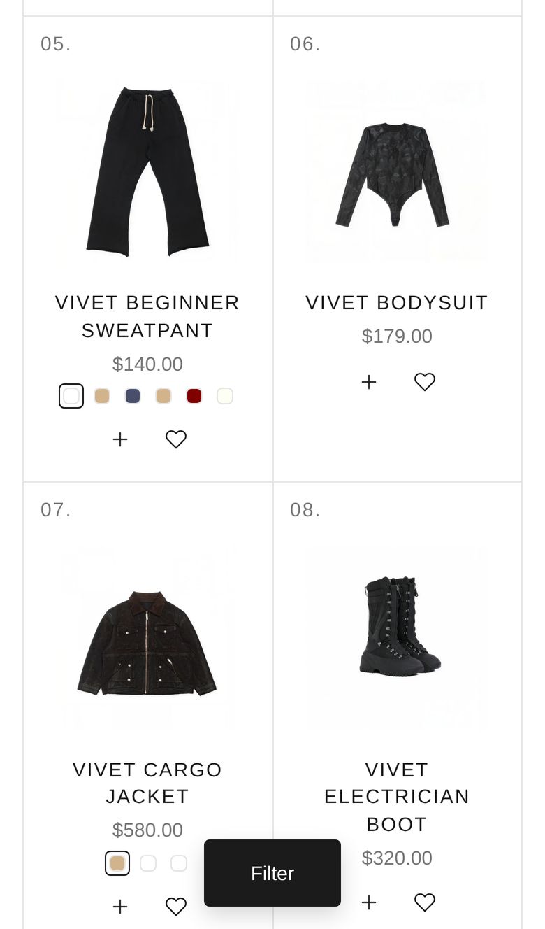
Collection page: Classic has the same filters, cards and grid settings (three per row, photos in their own shapes, no numbers) plus a Menu column block. Pick its Menu, its Position (Left or Right), and whether On phones it is Hidden (default) or Above products.
The all-collections page
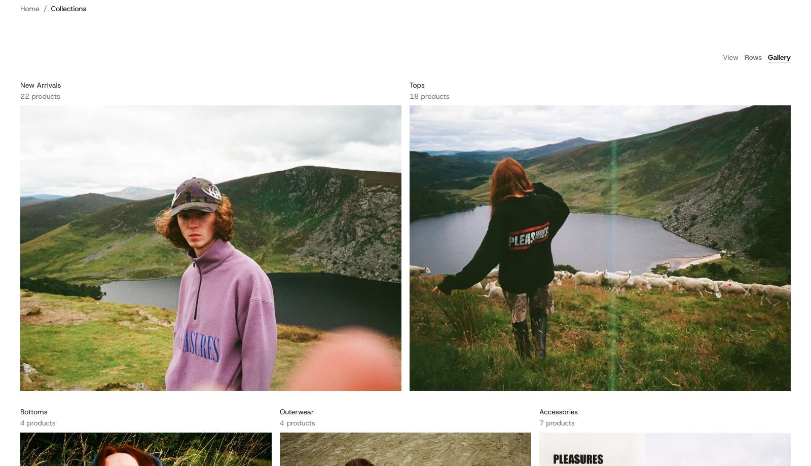
This page has one section, Collections: List. It lists nothing until you choose. Add collections under Collections, in your order. Until then shoppers see "No collections yet.", while the editor shows five samples.
| Setting | What it changes | Options |
|---|---|---|
| Opens as | Rows puts each name beside three of its products. Gallery shows the collections' pictures in a grid. | Rows, Gallery (default) |
| Let shoppers switch | A Rows / Gallery switch above the list, remembered on their device. | On (default) |
| Layout | Pictures per Gallery row on computers; the first collections get the largest. Phones show two across. | Two, then three (default); Two across; Three across; Four, then three; Custom |
| Row pictures (Photos block) | What sits beside each name in Rows. | Product photos (default), Collection image |
Hide Product count or Description to leave them out; add a Header block for a title.
Good to know
- No products after filtering shows "No products found" and a "Clear all filters" link.
- Back and Forward in the browser step through a shopper's filters and sorting.
- Product numbers restart at 01 every 24 products as shoppers scroll, and on each numbered page.
Related
- Theme settings: badges, quick add, favorites, product card corners
- Set up color swatches
- Search page: the same filters and cards
- Shared settings