Search page
How shoppers search your store, from the search icon in the header to the full page of results with filters.
Shoppers can search in two places. The search icon in your header opens a search overlay: a bar across the top of the page that shows matching products as they type. Pressing Enter there, or "Show all results", opens the search page: the same search as a full page, with filters, sorting and the same product cards as your collection pages.
Both search your products only. Pages and blog posts are not included.
When shoppers see this page
- The overlay opens from the search icon in the header, or the one at the bottom of the menu that slides out. It closes with the ×, the Escape key, or a click on the page below it.
- The search page opens when a shopper presses Enter in the overlay, follows "Show all results for …", or visits your
/searchaddress. With nothing searched yet, it shows only the search field.
The search overlay
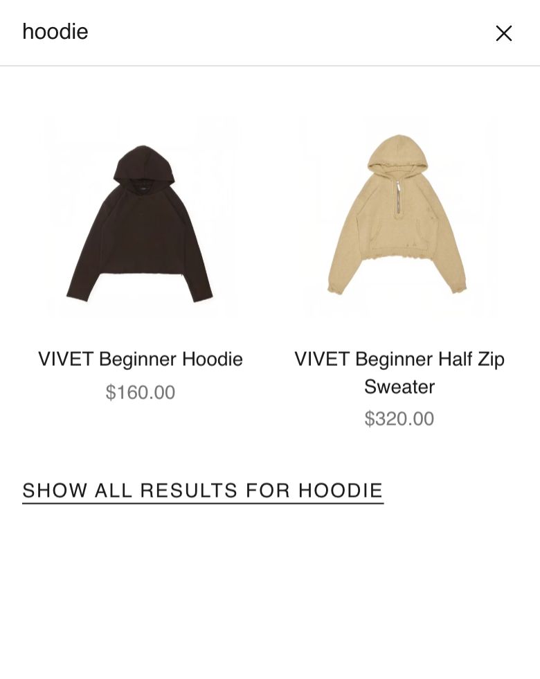
As a shopper types, a panel of product cards slides down under the bar, with sold-out products last. Under the cards, "Show all results for …" opens the search page. With no matches, the panel says: Your search for "…" did not yield any results.
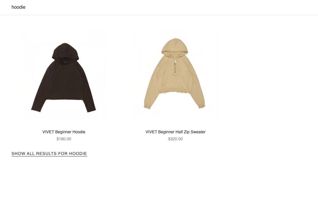
This example uses the search term “hoodie”.
Edit it. The overlay is one section, Search overlay, kept with the cart drawer in the Overlays group of the editor's section list. There is one for your whole store. In the editor it shows your own products as a sample so you can see each change.
| Setting | What it changes | Options |
|---|---|---|
| Frosted glass | The page shows through the bar and panel, softly blurred. | Off (default) |
| Number of results | How many products the panel shows. | 4 to 10. Default: 8 |
| Width | Page width keeps the cards inside your page margins; Full width runs them to the edges of the screen. | Page width (default), Full width |
| Grid style | Ruled draws thin lines between products. | Standard (default), Ruled |
| Products per row (desktop) / (mobile) | Cards across. | 2 to 8, default 4 / 1, 2 (default), 3 |
Color scheme sets the bar and panel colors (see shared settings). Under the section, the Product media and Price blocks set the photo frame, badges and price, with the same settings as on the collection page.
The overlay cards are simpler than collection cards: a photo, the name and the price. They have no quick add, heart or color swatches.
The search page
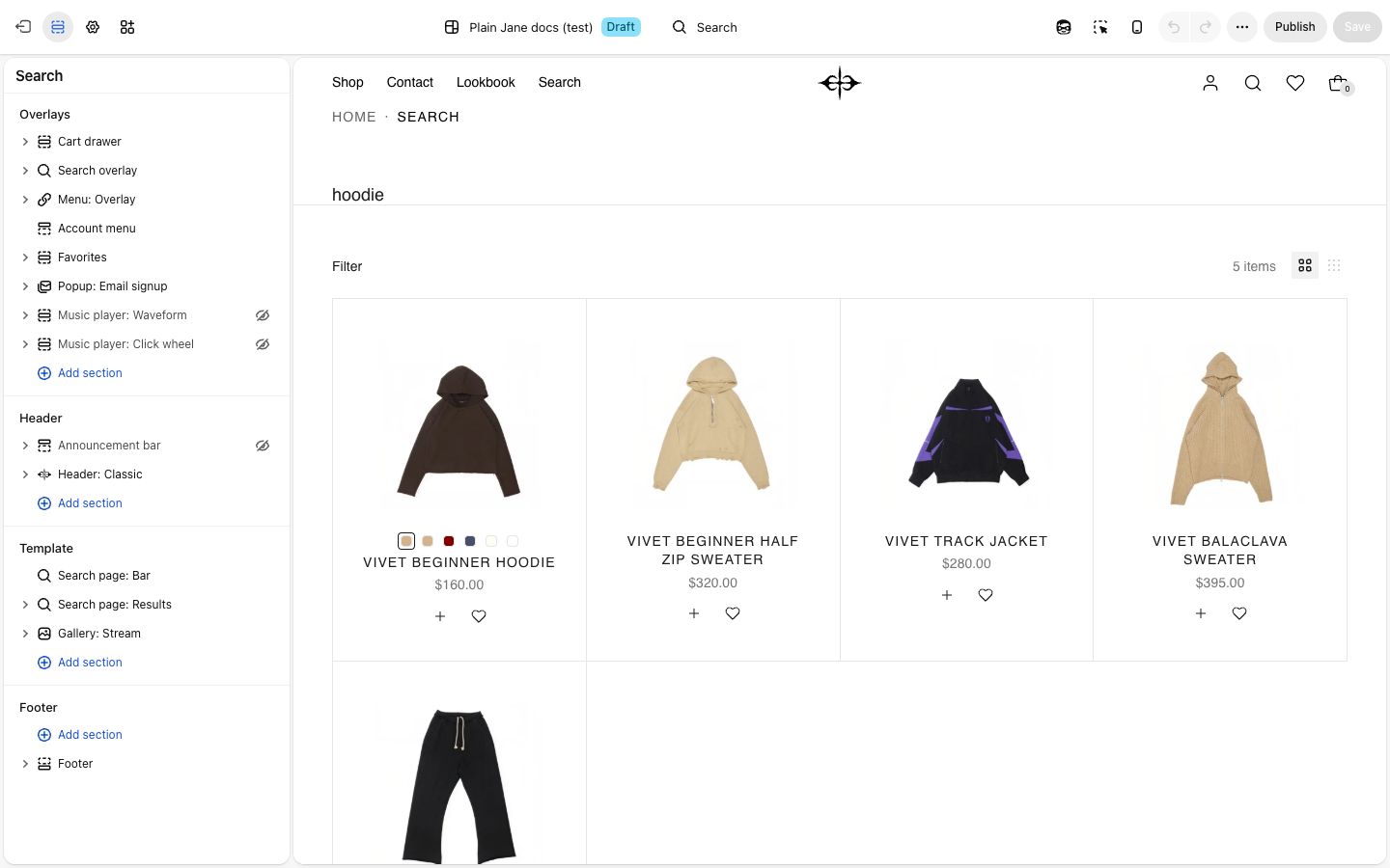
Open the search page in the editor. It has two sections:
- Search page: Bar: the search field across the top. It opens filled in with what the shopper searched for, and the words in it act as the page's title. Pressing Enter shows the new results without reloading the page. Results do not change while typing here; that is the overlay's job.
- Search page: Results: the filter bar and the products.
The Bar has only Color scheme, Space above and Space below. Both can only be used on the search page.

Results
The Results section works like Collection page: Grid, with the same settings and blocks: grid style, products per row, auto-load as you scroll, Filters & sort, and the Product card with its photo, title, price, swatches and quick add buttons. See Collection page for each one.
What starts differently here:
| Setting | On the search page |
|---|---|
| Grid style | Ruled |
| Show count beside each filter value | Off |
| Show product number | Off |
| Details alignment | Center |
| Order of the card's blocks | Color swatches first, then title, price, buttons |
Sorting on the search page offers what Shopify allows for search results, which is fewer choices than on a collection: usually relevance and price.
Filters come from the Search & Discovery app in your Shopify admin, as on collections. To get color swatches in the Color filter, see Set up color swatches.
On phones
The overlay bar sits where your header is, and results show two across. On the search page, cards sit two across, a Filter button stays at the bottom of the screen once the shopper scrolls past the filter bar, and the filter panel opens full screen.
Tips
- Set Number of results to a whole number of rows: 8 with 4 per row, or 6 with 3.
- Keep the card settings on the search page close to your collection pages, so a product looks the same wherever a shopper finds it.
Good to know
- In the editor, with nothing searched, the results section shows two rows of your products so you can style it. Shoppers never see these: their page shows only the field until they search.
- No results shows: Your search for "…" did not yield any results, with a "Clear all filters" link.
- Shoppers who turn on Reduce transparency on their device see the frosted overlay solid.
Related
- Collection page: filters, sorting and product cards in full
- Theme settings: badges, quick add and favorites
- Set up color swatches
- Shared settings