Page not found: Crowd
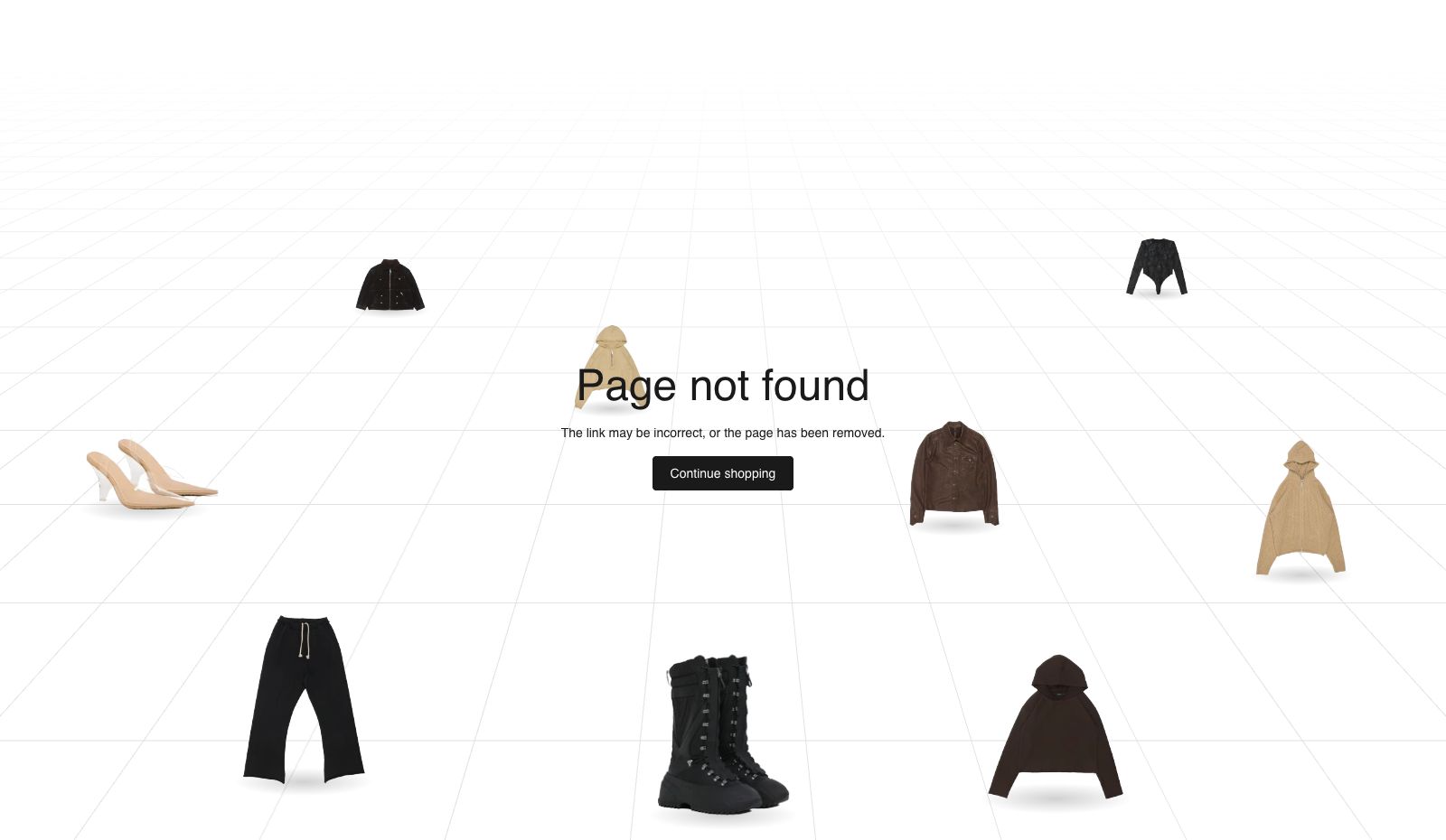
Your products stand around the words "Page not found" like people on a floor, each one a link to its product page.
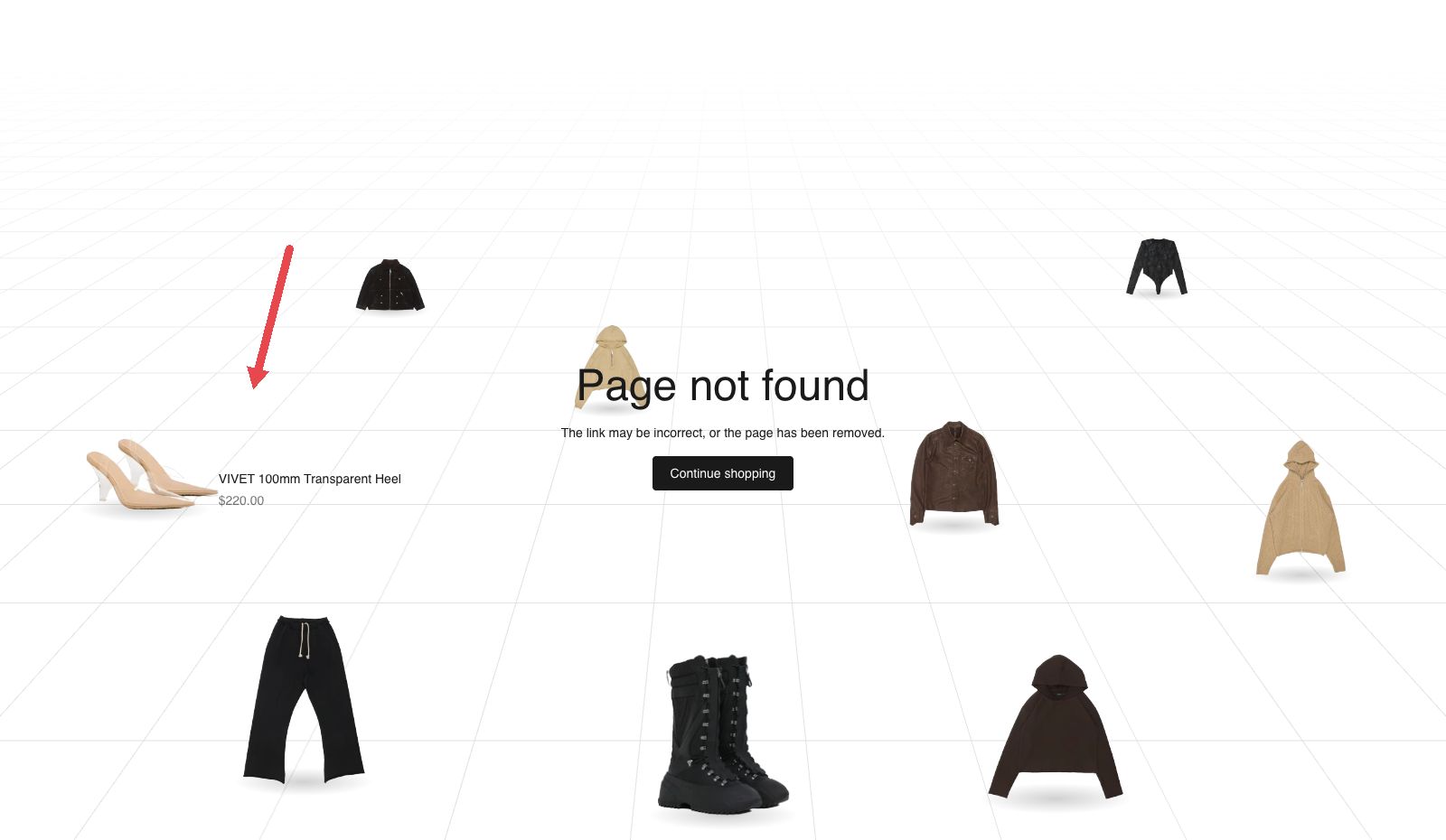
When a visitor follows a broken link, they land here. Instead of a dead end, they see your products standing on a floor around a heading, a line of text and one button. Each product is cut out of its photo, so it stands free with no box around it. Pointing at one shows its name and price, and clicking it opens the product.
Choose it when your product photos are on a white or see-through background. If they are not, the plain "Page not found" section is the better fit.
Add it
This section only works on the 404 page, and only once. Plain Jane already puts it there, so there is nothing to add on a new store.
To edit it, open the page picker at the top of the editor and choose the 404 page. If you removed it, choose "Add section" on that page and look for Page not found: Crowd under Text.
As first added it fills the screen, with the heading "Page not found", the line "The link may be incorrect, or the page has been removed." and a "Continue shopping" button that leads to all your products. Nine products from your whole catalog stand around the words.
What you need
- At least six products with a photo. Nine or twelve fill the floor better.
- Photos on a white or see-through background. The section removes the background from the edges of the photo inwards and stands the product on the floor. A photo with a colored or busy background cannot be cut out, so that product is left out.
- The first photo of each product is the one used. It needs to be at least 160 pixels wide and tall.
- Full-length photos stand best. A tall, narrow photo stands as a full-height person. Wider things, such as a bag or a folded shirt, stand lower. A photo that is cut off at the bottom edge fades into the floor.
Settings
Select the section itself to see these.
| Setting | What it changes | Options |
|---|---|---|
| Color scheme | The background, the text, and the color of the floor's lines (the scheme's border color). See shared settings. | Any of your schemes. Default: Scheme 1. |
| Height | How tall the floor is. Full screen fills the window below your header. The other three are shorter and leave room for what comes next on the page. | Small, Medium, Large, Full screen. Default: Full screen. |
| Space above | Empty space above the words and products. The floor's lines run through it. See shared settings. | None, Small, Medium, Large, Custom. Default: None. |
| Custom space above | The exact space. Only appears when Space above is Custom. | 0 to 200 px. |
| Space below | Empty space under the floor. | None, Small, Medium, Large, Custom. Default: None. |
| Custom space below | The exact space. Only appears when Space below is Custom. | 0 to 200 px. |
With Height on Full screen, any space you add above or below is taken out of the floor, so the section still fits one screen.
Blocks
The section has four blocks: Heading, Text, Button and Crowd. They are always there. You cannot remove them, add a second one or change their order.
Crowd
Who stands on the floor, and whether they move.
| Setting | What it changes | Options |
|---|---|---|
| Products | The products that stand on the floor. | Up to 12 products. Default: none chosen. |
| Collection | Where the products come from when Products is empty. If both are empty, they come from your whole catalog. | Any collection. Default: none chosen. |
| Number of products | How many stand on the floor. | 6, 9 or 12. Default: 9. |
| People step aside | On: when a visitor moves the pointer through a product, it turns sideways, takes a few steps out of the way and turns back. It stays where it stops. Off: everyone stands still. | On or off. Default: off. |
| Second photo while moving | Shows a product's second photo while it steps aside. Only appears when People step aside is on. | On or off. Default: off. |
Heading
The large words in the middle. They are the page's main heading.
| Setting | What it changes | Options |
|---|---|---|
| Text | The words. | Default: "Page not found". |
| Style | Which of your theme's heading styles the words use. | Heading 1 to Heading 6, Uppercase. Default here: Heading 1. |
Text
The line under the heading. This is the same Text block used across Plain Jane, so it has its full set of settings. Here the section keeps it centered under the heading.
| Group | Settings | As added here |
|---|---|---|
| (top) | Text | "The link may be incorrect, or the page has been removed." |
| Layout | Width, Line length, Alignment (appears when Width is Fill container) | Fit content, Short |
| Appearance | Style; Font, Size and All caps (appear when Style is Custom); Stay readable over photos; Color and Custom color; Background, Background color and Corners | Body, your text color, no background |
| Spacing | Top, Bottom | 0 |
| Animation | Animation; Speed (appears when an animation is chosen) | None |
Button
The one button under the text. It is the same Button block used across Plain Jane.
| Group | Settings | As added here |
|---|---|---|
| (top) | Label, Link, Open in new tab, Style, Corners, Disable uppercase | "Continue shopping", linking to all products, Primary |
| Glass override | Override scheme colors (appears when Style is Glass); Tint, Text, Hover tint, Hover text | Off |
| Size | Width (desktop), Width (mobile), each with a Custom width | Fit content |
On phones
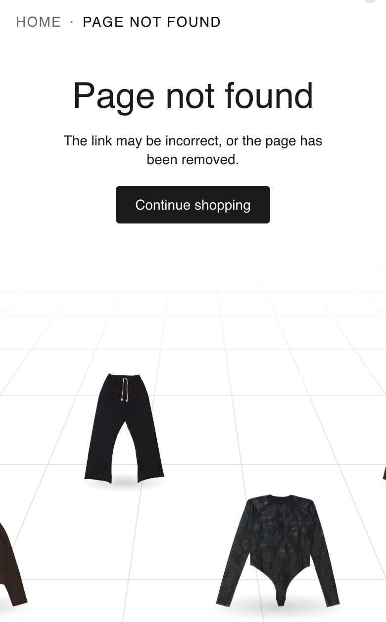
The words sit at the top and the products stand in a row under them, some nearer and some further back. Visitors swipe the row sideways. Once they have swiped and stopped, the product in the middle shows its name and price. With People step aside on, everyone turns and walks while the row is being swiped, then faces front again.
Tips
- If you choose the products yourself, pick a few more than Number of products. The extras wait as stand-ins: when a photo cannot be cut out, the next product on your list takes its place.
- Check the result after choosing. If someone is missing, their first photo has a colored or busy background, or is too small.
- Turn on Second photo while moving only if your second photos are side views on a white or see-through background. Otherwise the product simply turns on the spot with its first photo.
- Keep the heading short. On desktop one product stands partly behind it, and nobody stands in front of the text or the button.
Good to know
- Nothing moves by itself. With People step aside off, pointing at a product only shows its name and price.
- A visitor who moves the pointer slowly onto a product and stops gets its name and price, even with People step aside on. Only a pointer passing through makes it step away.
- Visitors who have asked their device to reduce motion never see anyone move. Names and prices still show.
- Visitors using a keyboard can tab to each product. Its name and price show when it has focus.
- A product on sale shows its sale price with the old price crossed out. A product whose price depends on the option shows "From" and its price.
- If fewer of your products can be cut out than Number of products, fewer stand. The section never borrows products from outside the list or collection you chose.
- Products without a photo are skipped.
- If a visitor's browser has scripts turned off, the same products show as a plain row under the words, each with its name and price.
Related
- Shared settings: Space above, Space below, Color scheme and Height.
- Cart page
- Theme settings