Products: Recommended
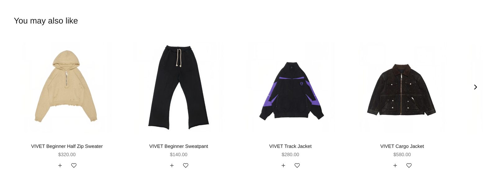
A row of products Shopify finds similar to the one on the page, under the heading "You may also like".
A row of other products under the heading "You may also like". Shopify chooses them: products similar to the one the shopper is looking at. You do not pick them. Shoppers scroll the row sideways, and each card opens its product.
If you would rather choose the products that go with each one yourself, use Products: Complementary. It is the same section set to show your picks.
Add it
It only works on product pages. Plain Jane puts it under the product on every product page template. To add another, open a product page in the editor and find Products: Recommended under Product page in "Add section". A page can hold two of these sections (for example one Recommended and one Complementary).
As first added it shows up to eight products, four at a time, each with its photo, name and price.
What you need
- Enough products for Shopify to find similar ones. Shopify works the suggestions out itself, and a new or small store may get few or none at first.
Settings
| Setting | What it changes | Options |
|---|---|---|
| Color scheme | The background, text and buttons. See shared settings. | Default: Scheme 1. |
| Width | Page width keeps the row inside your page margins. Full width lets the cards scroll out to the screen's edges, while the heading and first card stay on the page margin. | Page width, Full width. Default: Page width. |
| Space above, Space below | Empty space at the top and bottom. See shared settings. The Custom slider goes to 120 px above and 200 px below. | Default: Medium. |
Products
| Setting | What it changes | Options |
|---|---|---|
| Products to show | Related: Shopify picks products similar to this one. Complementary: the products you picked in the Shopify Search & Discovery app. | Related, Complementary. Default here: Related. |
| Product | Suggest products for this product instead. Leave empty to use the product the shopper is viewing, which is what you want on a product page. | Any product. |
| Maximum products | The most cards the row shows. Shopify may send fewer. | 2 to 10. Default: 8. |
Layout
| Setting | What it changes | Options |
|---|---|---|
| Cards per row | How many whole cards show at once on a computer. | 2 to 6. Default: 4. |
| Cards per row (mobile) | How many show at once on a phone. | 1 to 3. Default: 2. |
| Show scroll arrows | Arrows over the edges of the photos. Desktop only, and only when there are more products than fit. | Default: on. |
| Space below heading | The gap between the heading row and the cards. | Small, Medium, Large. Default: Medium. |
Blocks
Three blocks are always there.
- Heading row holds a Heading ("You may also like"). You can change the words or add Text, a button and other blocks. Its settings: Alignment (Left, Center, Right; default Left) and Space between items (Small, Medium, Large; default Medium).
- Product card is the look of every card. It works the same as in Products: Grid; see Product card. Here it starts with Product title and Price only. Add Quick add & favorite to let shoppers add a suggestion to their cart without leaving the page.
- Product row sets how the cards sit: Card arrangement (In a line, Alternating, Scattered; default In a line), Show next card partially (default on) and Space between cards (Small, Medium, Large; default Medium).
On phones
Shoppers swipe the row. The arrows are hidden on touch screens.
Good to know
- The cards load just after the rest of the page. On a slow connection the row may show grey boxes for a moment while they arrive.
- If Shopify has nothing to suggest, the section is hidden from shoppers. In the editor you see products from your store instead, so you can still style the row.
- The product on the page never appears in its own row.