Hotspots: Scene
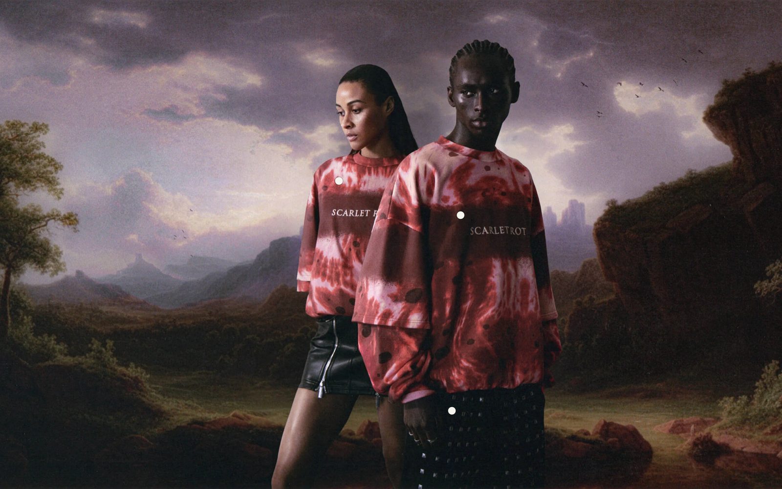
One wide photo with a dot on each thing to shop. Pointing at a dot shows its name and price, and arrows lead on to another page.
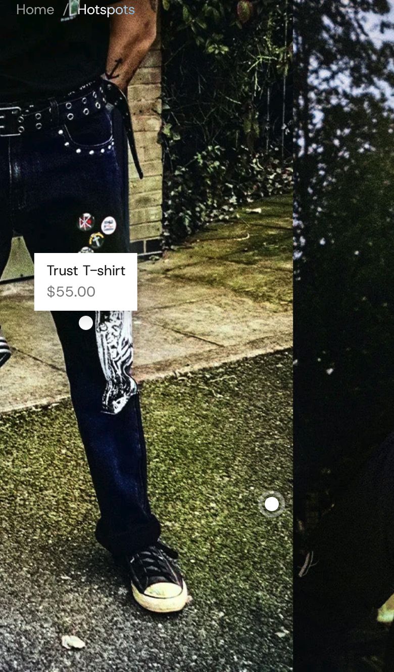
One wide photo, such as a room, a street or a styled outfit, with a dot on each thing you sell. A shopper points at a dot (or taps it on a phone) and a label opens with the product's name and price; clicking the label opens the product. Round arrows on the photo lead to another page, like a door into the next room.
Choose it when one strong photo shows several of your products together. To show products as cards, use Products: Grid or Products: Row.
Add it
It can go on any page except the password page. Find Hotspots: Scene under Products in "Add section".
As first added it fills the screen with a grey sample drawing, three dots labelled "Oversized hoodie", "Cargo pants" and "Leather sneakers", and two arrows: "Studio" on the left and "Street" on the right, both leading to all your products. The dots have no product yet, so they open their label and lead nowhere until you pick one.
What you need
- One wide photo, at least 2560 pixels across. A 16:9 shape (like 2560 × 1440) works best.
- A focal point set in Shopify's image editor on the part of the photo that matters most. Phones open the photo there, and Full screen trims around it.
- The products in the photo. Each dot links to one.
Settings
| Setting | What it changes | Options |
|---|---|---|
| Photo | The picture everything sits on. | Any image. |
| Color scheme | The background, and the color of the dots, their labels and the arrows. See shared settings. | Default: Scheme 1. |
| Height | Full screen fills the screen from top to bottom. On a wide screen it trims the photo's edges around its focal point, so keep dots away from the edges (arrows always stay on screen). Whole photo shows all of the photo at the screen's width. | Full screen, Whole photo. Default: Full screen. |
| Corners | How round the labels and arrows are. The dots stay round. | None, Slight, Round. Default: Slight. |
| Show swipe hint | A hand that sweeps side to side to show shoppers they can swipe. It only shows when the photo is wider than the screen, and stops once they swipe or tap. | Default: on. |
| Space above | Empty space above the photo. With None, the photo runs up under your menu when the section is first on the page. See shared settings. | Default: None. |
| Space below | Empty space under the photo. | Default: None. |
Blocks
Add as many Hotspot and Arrow blocks as you need. Each one has its own place on the photo.
Hotspot
A dot that opens a label. A soft ring pulses out of each dot until it is opened, so shoppers can tell the photo is clickable.
| Setting | What it changes | Options |
|---|---|---|
| Link to | What clicking the label opens. With None, the dot only opens and closes its label. | Product, Link, None. Default: Product. |
| Product | The product the label opens. Used when Link to is Product. | Any product. |
| Link | Any page. Appears when Link to is Link. | Any link. |
| Label | The words in the label. Leave empty to use the product's name. | Text. |
| Show price | Shows the product's price under its name. Appears when Link to is Product. | Default: on. |
| Horizontal position | Where the dot sits across the photo: 0% is the left edge, 100% the right. | 0 to 100%. Default: 50%. |
| Vertical position | Where it sits down the photo: 0% is the top, 100% the bottom. | 0 to 100%. Default: 50%. |
| Use the section's colors | Turn off to give this dot its own Color scheme, for example so it shows against a dark part of the photo. | Default: on. |
Arrow
A round arrow that leads to another page. Its label slides out when a shopper points at it.
| Setting | What it changes | Options |
|---|---|---|
| Link | The page it opens. An arrow without a link shows only in the editor, so shoppers never meet one that goes nowhere. | Default: all products. |
| Label | Where the arrow leads, like the next room's name. | Default: "Next look". |
| Direction | Which way it points. | Left, Right. Default: Right. |
| Horizontal position, Vertical position | Where the arrow's point sits on the photo. | 0 to 100%. Default: 90% across, 50% down. |
| Use the section's colors | Turn off to give this arrow its own Color scheme. | Default: on. |
On phones
On a phone held upright the photo fills the screen's height and scrolls sideways, opening on its focal point. Shoppers swipe to look around. The first tap on a dot or arrow opens its label, and a second tap opens the link. A tap anywhere else closes it.
Tips
- Place dots in the editor: select a Hotspot block and the photo scrolls to it and opens its label while you move the sliders.
- Labels open below a dot near the top of the photo and towards the middle near the left and right edges, so they stay on the photo.
- With Height on Full screen, check the section on a wide window as well as a laptop. Dots near the edges can be trimmed away.
- Link arrows to other pages that use this section, each with its own photo, to make a walk from room to room.
Good to know
- The dots stay on the same spot in the photo on every screen size.
- With a mouse, shoppers can also drag the photo sideways when it is wider than the screen.
- Visitors using a keyboard can tab to each dot and arrow, and Escape closes an open label.
- Visitors who ask their device to reduce motion see no pulse, and a still hand instead of a moving one.
- Product stays in the panel when Link to is Link or None, but is only used with Product.