Story row
A sideways row of pictures at one height and their own widths, each with a few words underneath and an optional link.
A row of pictures that shoppers scroll sideways. Every picture is the same height but keeps its own shape, so tall and wide shots sit side by side at uneven widths. Under each one is a short title and a line or two of text. Choose it to tease several stories at once, such as journal posts, campaigns or collaborations, each linking to its own page.
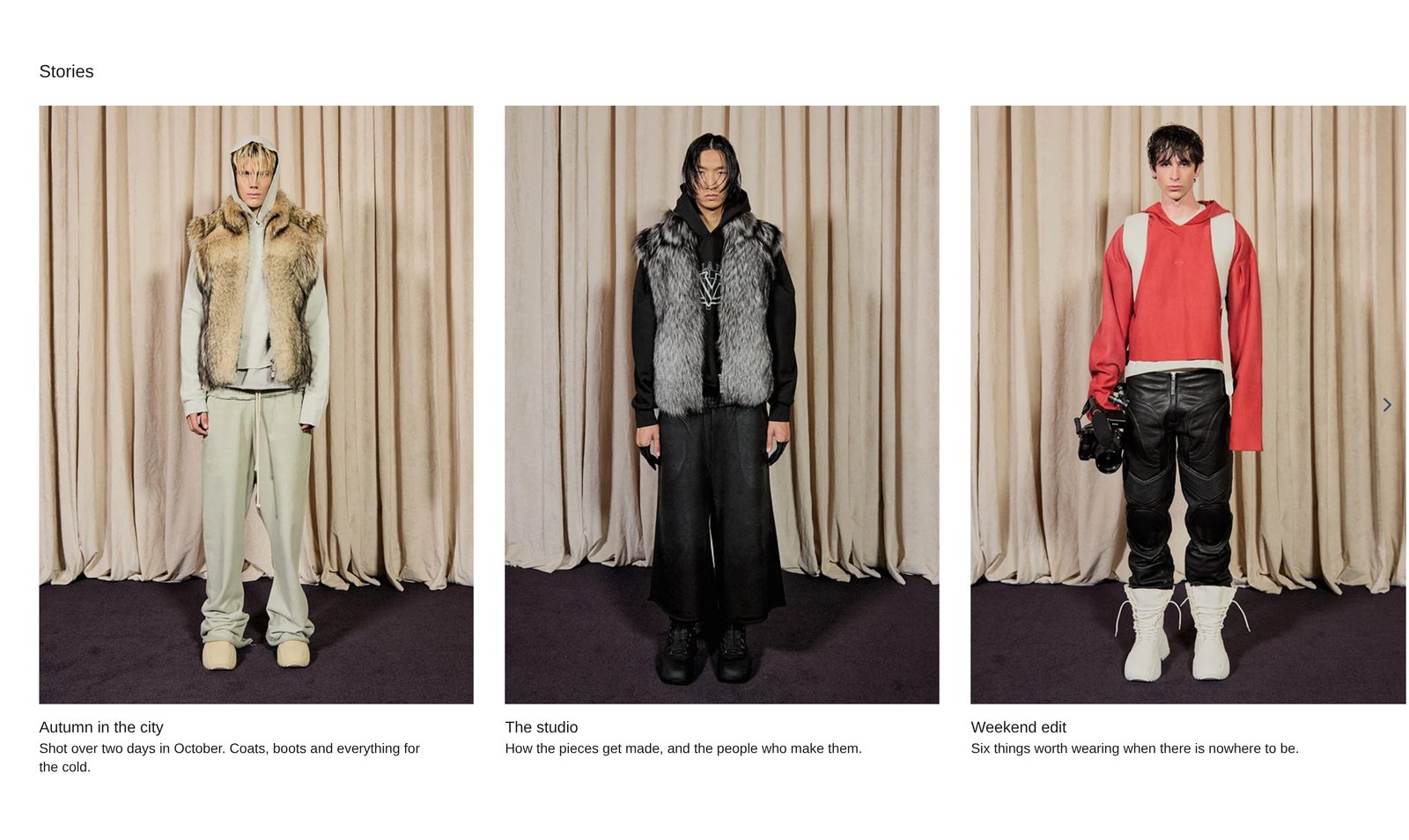
Add it
Add it to any page except the password page, from Storytelling in "Add section". It cannot go in the header or footer.
As first added it has the heading "Stories" and four Story blocks, each with a title (the first is "Autumn in the city") and a line of text. In the editor, stories without a picture show a sample drawing; shoppers never see a story without a picture.
What you need
- Four to eight pictures. Mixing portrait and landscape shots gives the row its uneven rhythm.
- A page to link each story to, if you want them clickable.
Settings
Select the section itself to see these.
| Setting | What it changes | Options |
|---|---|---|
| Color scheme | Background and text. See shared settings. | Default: Scheme 1. |
| Show scroll arrows | Arrows at the left and right edges of the row, level with the middle of the pictures. They only show for people using a mouse; touch screens swipe. With arrows off, mouse users get a thin scroll bar under the row. | On (default) or off |
| Space above, Space below | See shared settings. Custom stops at 120 px here. | As added: Medium. |
Blocks
Two fixed blocks: Heading row and Stories. You cannot remove them.
Heading row
Holds the heading above the row. Add a Heading, Text or Button. Alignment sets them Left (default) or Center. Leave it empty and the section shows just the pictures.
Stories
Settings that apply to every picture, so the row stays matched.
| Setting | What it changes | Options |
|---|---|---|
| Height | How tall every picture is. It scales with the screen. | Short, Medium (default), Tall |
| Image shape | Adapt to image shows each picture whole, at its own width. The others trim every picture to one shape. | Adapt to image (default), Portrait, Square, Landscape |
| Corners | How round the picture corners are. | None (default), Slight, Round |
| Space between pictures | The gap between stories. | None, Small, Medium, Large (default) |
| Alignment (under Words) | Where the words under each picture line up. | Left (default), Center, Right |
| On phones | Swipe sideways keeps the row. Stack down the page shows one picture after another at full width, each at its own height. | Swipe sideways (default), Stack down the page |
Story
One picture and its words. Add, remove or drag to reorder.
| Setting | What it changes |
|---|---|
| Picture | The picture. Any shape works. |
| Link | Where shoppers land when they click the picture. The words underneath are not a link, so shoppers can select and read them. |
Inside each story, add a Heading, Text or Caption. As added, each has a Heading (style Heading 6) and a Text.
On phones
The row swipes, with the next picture peeking in. There are no arrows. With On phones set to Stack down the page, Height does not apply: each picture shows at full width at its own height.
Tips
- Keep the words short: a title and one line. Long text makes the cards uneven underneath.
- Choose Portrait or Square for Image shape if your pictures are all different sizes and the row looks busy.
- A mouse can also drag the row sideways.
Good to know
- A story with no picture is left out on your store, even if it has words and a link.
- Pointing at a picture with a mouse zooms it in very slightly. Visitors who reduce motion on their device see no zoom.