Lookbooks
Three ready-made lookbook pages, how to set one up on a page of your store, and how to fill it with your photos.
A lookbook page shows your shoots: a season's campaign, a collaboration, a set of product stills. Plain Jane has three lookbook templates, each built on its own section:
| Template | Section | What shoppers see |
|---|---|---|
| lookbook-grid | Lookbook: Grid | A few words above a grid of photos. With several lookbooks, a row of names on top switches between them. |
| lookbook-index | Lookbook: Index | A list of shoots, one row each: name, a line about it and the year on the left, small photos on the right. |
| lookbook-canvas | Lookbook: Canvas | A full-screen board of scattered photos that shoppers drag in any direction. It never ends: the photos come round again. |
You can also add these sections to any other page, from Storytelling when you add a section.
When shoppers see this page
A lookbook is an ordinary page of your store with a lookbook template. Shoppers reach it from wherever you link to it, such as your menu.
- In your Shopify admin, create a page under Online Store > Pages. Give it a title, such as Lookbook.
- On that page, choose lookbook-grid, lookbook-index or lookbook-canvas as its theme template, and save.
- Add the page to your menu so shoppers can find it.
- Open the page in the editor to add your photos.
The templates start with sample lookbooks and empty photo slots. Empty slots show as tinted frames in the editor only. Shoppers never see an empty box.
Edit it
Each section holds one or more Lookbook blocks. Add one per shoot or season. Inside each are its words and its photos. To add a photo, select the lookbook's photos and add an Image block, then choose the picture.
Lookbook: Grid
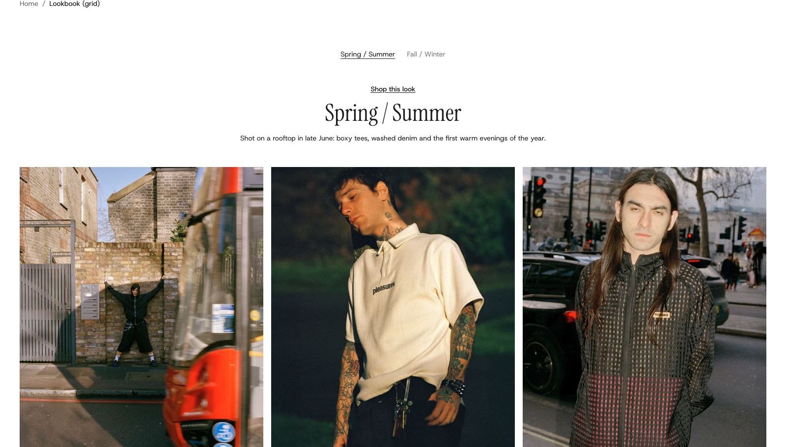
Each Lookbook block has a Name, shown in the row of names and at the top of its enlarged photos. Change it when you change the heading.
Words holds what sits above the photos: the template starts with a Shop this look link, a heading and a line of text. Set Alignment (Left, Center, Right) and Gap (Small, Medium, Large), and add any block you like.
Photos sets the grid:
| Setting | What it changes | Options |
|---|---|---|
| Photos per row on desktop | How many photos sit side by side. | 2 to 6. Default: 3 |
| Photos per row on phones | One or two. | One (default), Two |
| Space between photos | The gap between photos. | None, Small (default), Large |
| Image shape | Adapt to image shows each photo whole. The others crop every photo to one shape so the rows line up. | Adapt to image (default), Portrait, Square, Landscape |
| Corners | How round the photo corners are. | None (default), Slight, Round |
Lookbook: Index
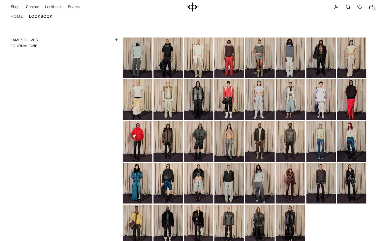
Each Lookbook block is one row. Its first three texts are the name, the line under it and the year. The fourth is the credits (photographer, styling, models). Shoppers open them with a Credits link, which only shows once the credits have words. Texts you add sit under the second line. To link a row's name to a collection, add a link to the name's text.
Shoppers press the + button to make a row's photos larger. Turn on Show large images by default to open a row large.
Images sets where the photos come from:
| Setting | What it changes | Options |
|---|---|---|
| Source | Your images uses the Image blocks you add. A product's images uses every photo of one product. | Your images (default), A product's images |
| Product | The product whose photos show, when Source is A product's images. | Any product |
| Image shape | As on the grid above. | Adapt to image (default), Portrait, Square, Landscape |
A product's images suits a big shoot: upload every photo to one product at once, then choose it here. Set that product to unlisted so it stays out of your store's search and collections. If the product has no photos, your Image blocks show instead.
Lookbook: Canvas
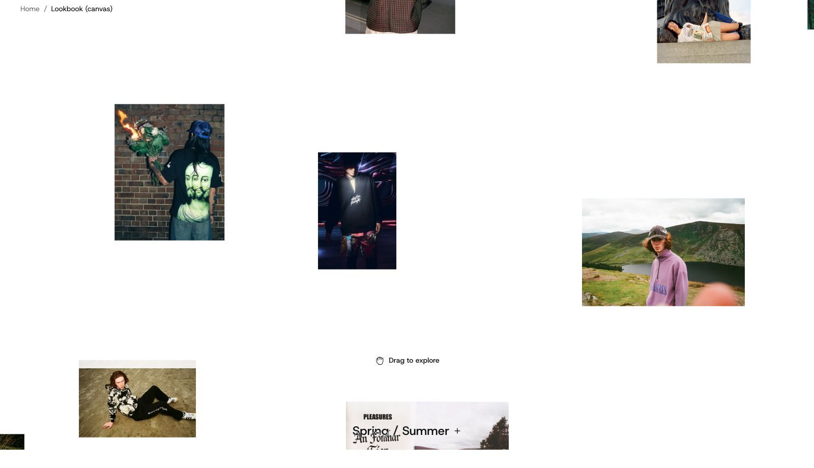
The board fills the screen and runs under your header. The name of the lookbook on show sits at the foot of the screen, on the photos. With more than one lookbook, shoppers press the name to choose another.
| Setting | What it changes | Options |
|---|---|---|
| Title style | The size of the lookbook's name. | Heading 3, Heading 4 (default), Heading 5, Heading 6 |
| Show the drag hint | A hand and "Drag to explore" at the foot until a shopper moves the photos. | On (default) or off |
| When shoppers scroll | The page scrolls past keeps normal scrolling; only dragging moves the photos. The photos move makes scrolling move the photos, so nothing below can be reached by scrolling. | The page scrolls past (default), The photos move |
Each lookbook's Photos has Picture size (Small, Medium, Large), Spread (Close together, Roomy, Airy: how much room sits around each photo) and Corners. Words works as on the grid. Anything you add there follows the name in the same row.
Click to enlarge, on all three
Click to enlarge sets what happens when a shopper clicks a photo. They can then step through that lookbook's photos with arrows, the arrow keys or a swipe.
- None: photos cannot be clicked.
- Fill the screen: one photo at a time on a plain background. The index template uses this.
- Over the page: one photo at a time over the dimmed page. The canvas template uses this.
- Scroll through all: every photo in the lookbook, one under another. The grid template uses this.
- Drag through all: every photo side by side at full height, to drag or scroll along.
Each section also has Color scheme. Grid and Index have Space above and Space below. See Shared settings.
Tagging products in a look
Lookbook photos cannot be tagged with products. To link a look to what is in it, add a button in Words (Grid and Canvas) or a link in the name (Index). To put dots on a photo that open each product's name and price, use the Hotspots: Scene section, which is built for that.
On phones
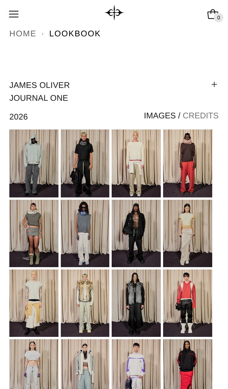
The grid shows one or two photos per row. The index stacks the words over the photos, with four small photos per line, or two when large (eight and three on desktop). On the canvas, a swipe always moves the photos, so shoppers cannot swipe past it. Put it last on the page, or alone.
Tips
- Add alt text to every photo, so shoppers who use a screen reader know what each one shows.
- On the canvas, 10 or more photos per lookbook keep the board from repeating too soon. The template starts with 14 and 8.
- Mix portrait and landscape shots on the canvas and with Adapt to image. Choose Portrait or Square on the grid for even rows.
Good to know
- Only one lookbook shows at a time on the grid and the canvas. The others are a click away in the row of names.
- Shoppers who turn on Reduce Motion get plain fades instead of glides in the enlarged view.