Gallery: Halo
A ring of pictures turns slowly around a button, heading or logo in the middle, and speeds up as visitors scroll.
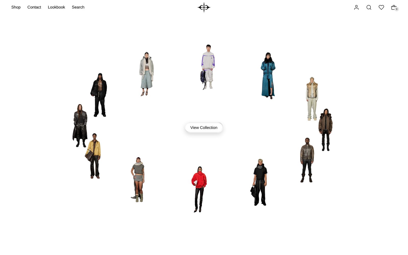
A ring of pictures circles slowly around whatever you put in the middle: a button, a heading, your logo. Scrolling the page spins the ring faster, and visitors can drag it round with the mouse or a sideways swipe. Pointing at a picture stops the ring and brings that picture forward.
Choose it to open a collection or a brand page with a lot of products at once, around one clear call to action.
Add it
It can go on any page except the password page, and not in the header or footer. In "Add section", find Gallery: Halo under Slideshows & galleries.
As first added it fills the screen with a tilted ring of twelve placeholder pictures around a "View all" button that leads to all your products.
What you need
- Eight to sixteen pictures. The ring shows up to 16; any more are left off.
- Or a collection or a list of products: each product's main photo is used, linking to the product.
- Product photos on a plain background suit Spotlight best.
Settings
Select the section itself to see these.
| Setting | What it changes | Options |
|---|---|---|
| Color scheme | The background and the colors of whatever is in the middle. See shared settings. | Default: Scheme 1. |
| Height | How tall the section is. The ring grows and shrinks with it. Large is about four fifths of the screen, Medium about three fifths. | Full screen, Large, Medium. Default: Full screen. |
| Space above, Space below | Empty space above and below. See shared settings. | Default here: None. |
On Full screen, as the first section on a page, it starts at the very top, under a header that sits over the page.
Blocks
The section has two blocks that are always there: Images (the ring) and Center (the middle).
Images
| Setting | What it changes | Options |
|---|---|---|
| Source | Your images uses the Image blocks you add. Collection or Products fills the ring with products instead. | Your images, Collection, Products. Default: Your images. |
| Collection | The collection used when Source is Collection. | Any collection. |
| Number of products | How many products from the collection. Only appears when Source is Collection. | 6 to 16. Default: 12. |
| Products | The products used when Source is Products. | Up to 16. |
| Ring shape | The path the pictures travel. | Tilted oval, Level oval, Circle. Default: Tilted oval. |
| Image size | How big each picture is. | Small, Medium, Large. Default: Medium. |
| Image shape | Adapt to image shows every picture whole, in its own shape. The others crop every picture to the same shape. | Adapt to image, Portrait, Square, Landscape. Default: Adapt to image. |
| Corners | How round the pictures' corners are. See shared settings. | None, Slight, Round. Default: Slight. |
| Hover effect | What happens to the picture a visitor points at. Zoom makes it a little larger. Spotlight does the same and fades every other picture to gray. | None, Spotlight, Zoom. Default: Spotlight. |
| Spin speed | How fast the ring turns by itself. With Off it stays still until visitors scroll or drag. | Off, Slow, Fast. Default: Slow. |
Image
One picture on the ring. Add up to 16 inside Images. They show only while Source is Your images.
| Setting | What it changes | Options |
|---|---|---|
| Image | The picture. Add alt text so screen readers can describe it. | |
| Link | Where the picture goes when clicked. Screen readers read the picture's alt text as the link's name, so describe where it goes. | Any link. |
| Open link in a new tab | Opens the link in a new tab. Only appears once Link is filled in. | On or off. Default: off. |
Center
What sits in the middle of the ring. It holds a Button ("View all") as added. You can add a Heading, an Image (a logo, for example), more buttons and most other blocks. Space between blocks sets the gap between them: None, Small, Medium or Large (default Medium).
If you add more than the middle can hold, Plain Jane shrinks it so it never runs into the pictures. Keep it to two or three blocks.
On phones
The ring is taller and reaches closer to the edges of the screen, to suit a narrow screen. Visitors swipe sideways to turn it. The first tap on a picture shows the hover effect; a second tap opens its link.
Tips
- Use Square or Portrait for Image shape when your photos come in mixed shapes. The ring looks tidier.
- With Spotlight, a visitor sees one product clearly at a time. It suits a ring of products on Collection or Products.
- A short heading and one button in the middle read best. Long text gets shrunk.
- Choose Circle for Ring shape with a logo in the middle; the tilted oval suits a button or heading.
Good to know
- If you choose Collection or Products but leave it empty (or the collection has no products), your own images show instead.
- There is no pause button. Pointing at, tapping or tabbing to a picture stops the ring.
- Visitors who have asked their device to reduce motion see a still ring. They can still drag it.
- The ring stops while it is off screen.