Editorial: Spread
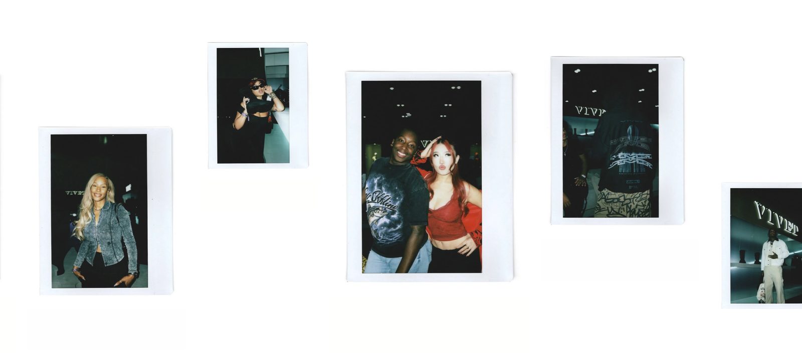
One endless row of photos at mixed heights, like a magazine spread, drifting sideways with captions and words beside them.
A single row of photos and videos of different heights, each set high, low or in the middle of the row like pictures on a magazine page. Each can carry a small caption running up or down its side, and words above, below, beside or over it. The row drifts sideways on its own, moves along as the page scrolls, and shoppers can drag it. It never ends. Choose it for a story told in pictures, such as a brand history or a behind-the-scenes shoot.
Add it
Add it to any page from Storytelling in "Add section". It cannot go in the header or footer.
As first added it has seven Photo blocks of mixed heights, showing sample pictures. Four carry a numbered chapter heading ("I Origins", "II Process", "III Style", "IV Selected work"), and the first has the caption "Shot by Ama Owusu — Studio, Brooklyn, 2026". Replace these with your own.
What you need
- Six to ten photos or short videos. Fewer works, but the row repeats sooner.
- A mix of shapes. Each picture is shown whole, at its own shape, so portrait and landscape shots sit side by side.
Settings
Select the section itself to see these.
| Setting | What it changes | Options |
|---|---|---|
| Color scheme | Background and text. See shared settings. | Default: Scheme 1. |
| Height | How tall the row is. Small is about half the screen, Medium about two thirds, Large most of it, with a cap on very tall screens. | Small, Medium (default), Large |
| Speed | How fast the row drifts on its own. | Slow (default), Medium, Fast |
| Space between photos | The gap between pictures. | None, Small, Medium, Large. As added: Medium. |
| Space above, Space below | See shared settings. | As added: Medium. |
Blocks
Photo
One picture in the row, with its caption and words. Add, remove or drag them to change the order.
| Setting | What it changes | Options |
|---|---|---|
| Image | The photo. | |
| Video | A video. It plays silently on a loop while on screen, and shows instead of the image. | |
| Placeholder | A sample picture, shown only while there is no image or video. Choose None to show no picture. | None, or one of Shopify's sample pictures. A Photo you add starts with Lifestyle 1. |
| Picture height | How tall this picture is, compared with the row. Short is 60%, Medium 80%, Tall the full height. | Short, Medium, Tall (default) |
| Vertical position | Where a shorter picture sits in the row. | Top (default), Center, Bottom |
| Caption | A short line set beside or under the picture, such as a photo credit. | |
| Position (under Caption) | Appears once there is a caption. Left, reading upward and Right, reading downward run it up the picture's side. | Left, reading upward; Right, reading downward (default); Below |
| Position (under Text) | Where the blocks you add to this photo sit. | Above, Below (default), Left, Right, Over the photo |
Inside each Photo you can add Text, Button, Group, Divider and other blocks. The sample chapter headings are Text blocks set to the Heading 5 style.
On phones
The row is capped by the screen's width as well as its height, so the next picture always peeks in. It drifts the same way, and shoppers swipe it.
Tips
- Mix Short, Medium and Tall pictures and vary Vertical position. All Tall at Top looks like a plain strip.
- Keep words over a photo short, and turn on Stay readable over photos in the Text block.
- A Photo you add shows a sample picture until you choose an image or video. Fill it or remove it.
Good to know
- The row pauses while a shopper drags it, while they move through it with the keyboard, and while you have one of its photos selected in the editor.
- Pointing at the row with a mouse does not stop it.
- Visitors who reduce motion on their device get a still row they scroll sideways themselves.
- Placeholder pictures show to shoppers as well. Replace or remove every sample before you publish.