Hero: Filmstrip
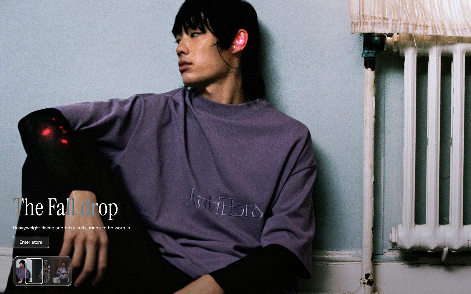
A full-screen photo or video with a row of small pictures along the bottom; it moves through them on its own, and visitors can pick one.
A large photo or video fills the section, with your heading, text and button on top. Along the bottom sits a row of small pictures, one per slide. Every few seconds a ring slides to the next small picture and the large photo changes to match. Visitors can click any small picture to jump to it.
Choose it when you have three or more photos that belong together, such as a new collection. For one photo, Hero: Classic or Hero: Depth fit better.
Add it
It can go on any page except the password page. In "Add section", find Hero: Filmstrip under Hero. As the first section on a page it runs up under your header.
As first added it fills the screen and has three slides with stand-in pictures, the heading "Built for the cold", a line of text and a "Shop now" button leading to all your products.
What you need
- Three to six wide photos (or short videos) that look good cropped to fill the screen. Set a focal point on each photo in Shopify to choose what stays in view.
- Alt text on each photo. It names the small picture for visitors using a screen reader.
Settings
| Setting | What it changes | Options |
|---|---|---|
| Color scheme | The colors of your words and button, and of the row's panel when Strip panel is Solid. See shared settings. | Default: Scheme 2. |
| Height | How tall the section is. Small is half the screen, Medium 70%, Large 85%. See shared settings. | Small, Medium, Large, Full screen. Default: Full screen. |
| Space above, Space below | Space around the section, in its own background color. With no space above, the photo runs up under your header. See shared settings. | None, Small, Medium, Large, Custom (0 to 200 px). Default: None. |
| Content position | Where your words and button sit on the photo. | Nine places, from Top left to Bottom right. Default: Center. |
| Filmstrip alignment | Where the row of small pictures sits along the bottom. | Left, Center, Right. Default: Center. |
Overlay
| Setting | What it changes | Options |
|---|---|---|
| Strength | Darkens the photo so your words stay easy to read. | None, Light, Medium, Dark. Default: Medium. |
| Overlay color | The color of the darkening. Only appears when Strength is not None. | Default: black. |
| Overlay style | Behind text darkens the part your words sit on; Whole photo darkens all of it. Only appears when Strength is not None. | Behind text, Whole photo. Default: Behind text. |
Thumbnails, Style and Playback
| Setting | What it changes | Options |
|---|---|---|
| Thumbnail size | How big the small pictures are. They are a little smaller on phones. | Small, Medium, Large. Default: Medium. |
| Gap | The space between the small pictures. | Small, Medium, Large. Default: Medium. |
| Thumbnail shape | The shape of the small pictures. | Portrait, Square, Wide. Default: Square. |
| Strip panel | The panel behind the row. Glass is frosted and see-through, Solid uses your scheme's background. | None, Glass, Solid. Default: Glass. |
| Active indicator | How the showing slide is marked. Border is a ring that slides from picture to picture. Highlight brightens the showing picture instead. | Border, Highlight. Default: Border. |
| Autoplay | How long each slide shows before the next. The slides always move on by themselves. | 2 seconds, 3 seconds, 5 seconds. Default: 5 seconds. |
Blocks
Slide
One photo or video. Two slides are always there and cannot be removed; you can add more.
| Setting | What it changes | Options |
|---|---|---|
| Type | Whether the slide is a photo or a video. | Image, Video. Default: Image. |
| Image | The photo. Only appears when Type is Image. | Any image. |
| Video | The video. It plays silently on a loop while its slide shows, and its cover picture is used in the row. Only appears when Type is Video. | Any video. |
Content
The words and buttons on the photo. It is always there.
| Setting | What it changes | Options |
|---|---|---|
| Max width | How wide your words can run. | Narrow, Medium, Wide, Full width. Default: Medium. |
| Gap between blocks | The space between the blocks inside it. | 0 to 80 px. Default: 16 px. |
Inside it you can add Heading, Text, Giant text, Short text, Button, Plain Jane's other general blocks and app blocks. As added, it holds a Heading (Heading 2 style), a Text and a Button.
On phones
The section keeps its height and crops the photo from the sides. The small pictures get smaller. If there are more than fit, visitors swipe the row sideways.
Tips
- Pick photos with a calm area where your words sit, or move the words with Content position.
- Use Highlight if the ring feels busy with Small thumbnails.
- With Wide thumbnails and many slides, the row fills up fast on phones. Square or Portrait keeps more in view.
Good to know
- Clicking a small picture, or pressing the left and right arrow keys on one, starts the countdown again from the beginning.
- The slides only move on while the section is on screen and the page is open in front of the visitor.
- Visitors who have asked their device to reduce motion see the photos change without the ring sliding. Videos show their still cover picture instead of playing.
- A video pauses while a visitor uses the keyboard inside the section, or after they tap the picture. Tapping again lets it play.
- There is no pause button for the slides.