Product page
The page for one product, in one of four layouts, with its photos, price, options and Add to cart, and two rows of other products below.
The product page is where shoppers look at one product, pick a size or color and add it to their cart. Plain Jane has four layouts for it. They share the same blocks (title, price, options, buy buttons), so what you learn in one works in all of them. What changes is how the photos are shown and where the details sit. Under the layout, every product page starts with two rows of products: Products: Recommended and Products: Recently viewed.
When shoppers see this page
Every product uses your default product template, which comes set up with Centerpiece, unless you give it another one.
Give a product a different layout
Plain Jane comes with one template for each layout:
| Layout | Template | What shoppers see on desktop |
|---|---|---|
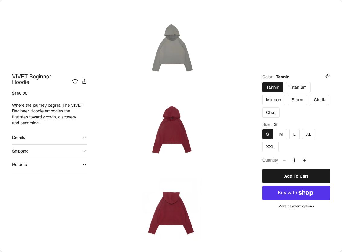
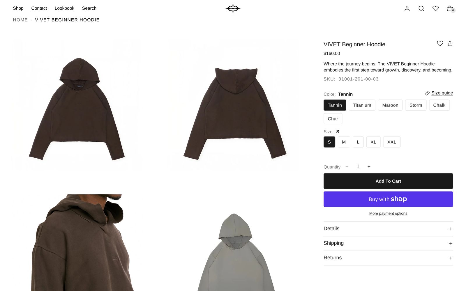
| Product page: Centerpiece | The default template | Photos down the middle, a column of details on each side. |
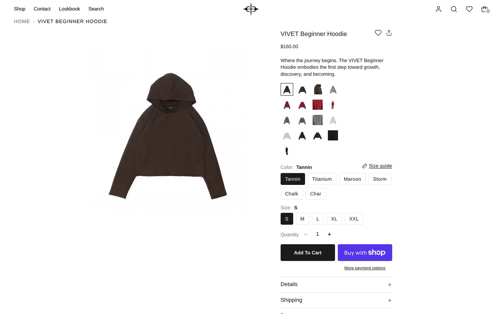
| Product page: Thumbnails | product-page-thumbnails | One large photo, with small photos to pick from beside the details. |
| Product page: Sidecar | product-page-sidecar | A grid of photos, with the details pinned beside them. |
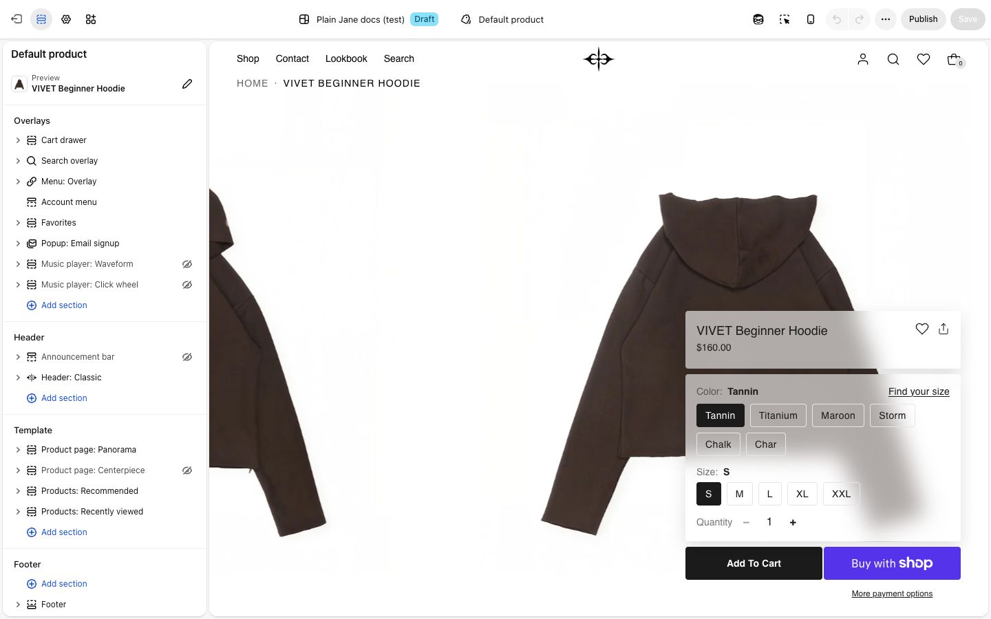
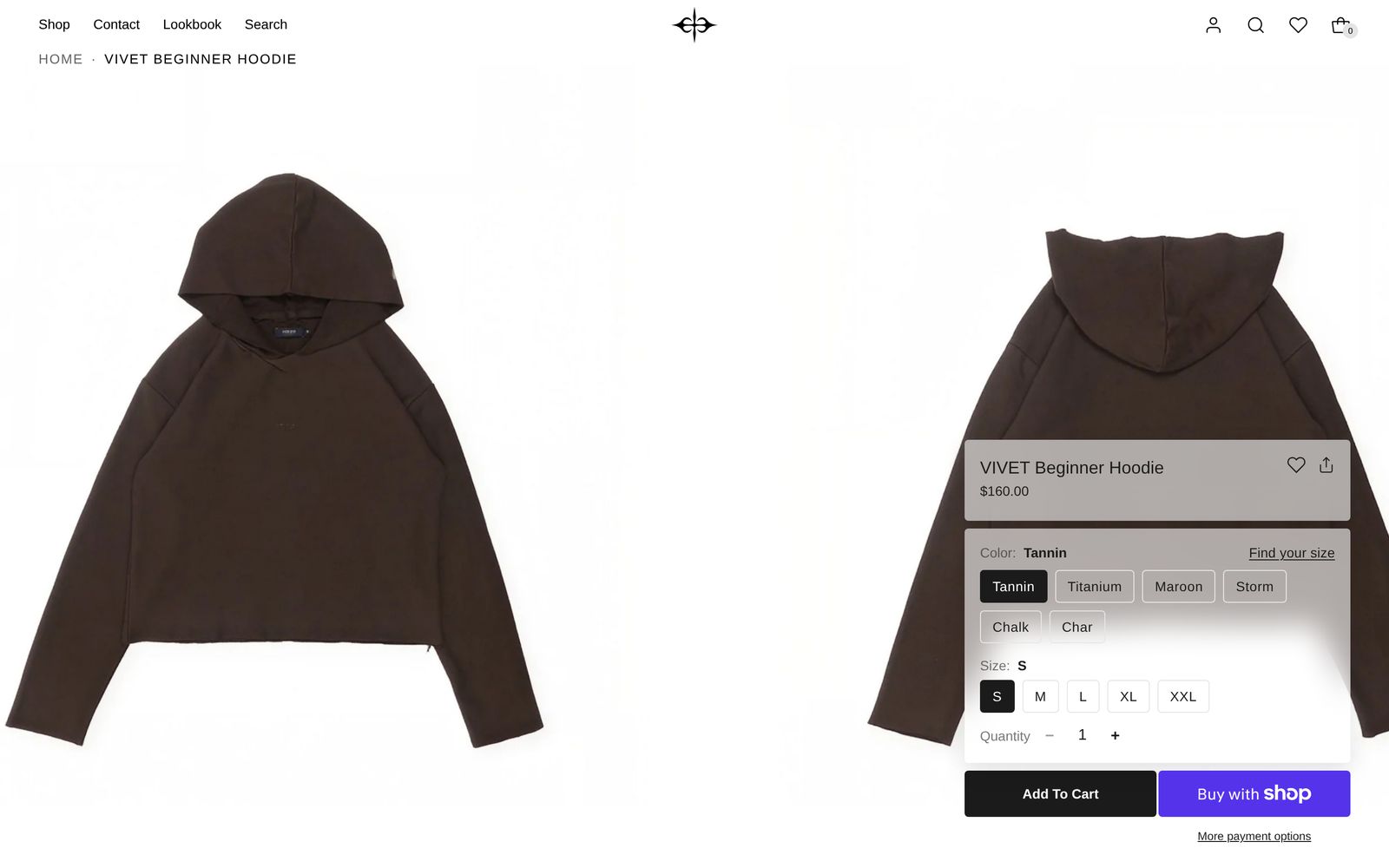
| Product page: Panorama | product-page-panorama | A strip of photos from edge to edge, with a buy panel floating over it. |
To use Sidecar for one product, open it in the Shopify admin and choose the product-page-sidecar template. To change the layout for every product, change the default template in the editor.
To swap the layout inside a template, add the new layout first, then remove the old one. If a page has two, the editor outlines the second and shows a note in the corner of the preview. Shoppers never see the note.
Edit it
Open a product page in the editor and preview a product with several photos and a few sizes or colors. The photos, description, price and options come from the product in the Shopify admin.
What every layout shares
Section settings
| Setting | What it changes | Options |
|---|---|---|
| Color scheme | The colors of the product area. See Color scheme. | Any of your schemes |
| Space above, Space below | See Space above and Space below. On every layout but Centerpiece, Custom goes up to 100 px. | None, Small, Medium, Large, Custom |
| Details spacing | On phones, the space either side of the details. Tight lines them up with your menu and cart icons. | Tight (default), Normal, Roomy |
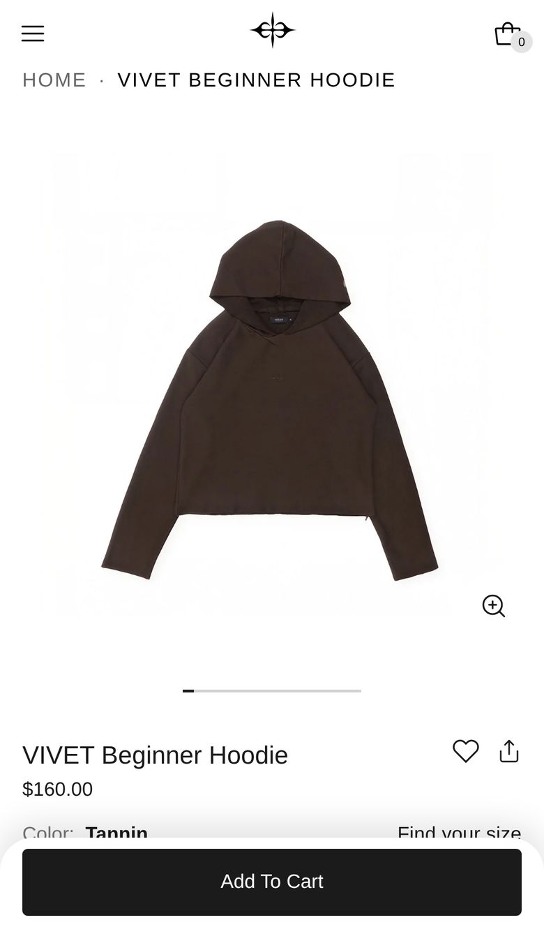
| Show mobile quick-add bar | On phones, a bar with the price and Add to cart appears once the page's own button scrolls away. | On (default) |
Photos on phones
All four layouts use the same phone gallery: shoppers swipe through the photos and tap one to see it full screen. Select Photos on phones to set Photo height (Adapt to image fits your first photo's shape; Short, Medium and Tall take a set part of the screen), Image fit (Fill the frame trims photos to fit) and Show full-screen button.
Blocks
- Product title. Turn on Show favorite button and Show share button to add a heart and a share button beside it. Thumbnails, Sidecar and Panorama start with both on.
- Price. With the sale price, unit price and Shop Pay installments when they apply.
- Review stars. The rating from your reviews app, such as Judge.me, Okendo or Yotpo. Products with no reviews show nothing.
- Variants. The options. Colors show as Swatches, Buttons (to start) or Dropdown; see Set up color swatches. With Show size guide link on, a Size guide link sits beside the first option on products that have a guide; see Set up size guides.
- Quantity selector and Buy buttons. With Show express checkout buttons on, a Shop Pay, Apple Pay, Google Pay or PayPal button sits under Add to cart. With Notify me when sold out on, a sold-out size lets shoppers leave their email; they join your customers, tagged so you can email them when it's back.
- Inventory status, Pickup availability and SKU. A low-stock note (below Low stock threshold, 10 to start), local pickup when you offer it, and the option's SKU.
- Description. Turn on Truncate long descriptions for a Read more link.
- Accordion. Rows that open and close, each holding text, a picture, a button or a video. The templates start with Details, Shipping and Returns rows: change their words to yours. To make a row say something different on each product, see Give each product its own accordion text.
- Text, Heading, Button, Image, Group, Spacer, Divider and app blocks, for anything else.
Model info
On Centerpiece, Thumbnails and Sidecar, a small card in a bottom corner shows who is wearing the product, on products that have a model picked. Set it up with Show who's wearing it. Panorama has no model card, because its buy panel sits in that corner.
Centerpiece
Photos run down the middle and shoppers scroll through them. The Details column (title, price, description, stars, accordion) and the Buy column (options, quantity, buy buttons) stay in view on either side. Both take any of the blocks above. Choosing a color scrolls to its photo.
| Setting | What it changes | Options |
|---|---|---|
| Desktop arrangement | The order of the three columns, left to right. | Details · Photos · Buy (default), and five more |
| Space between columns | The space between the photos and the columns. | Small, Medium (default), Large |
| Photos grow as you scroll | Each photo starts a little smaller and grows as it reaches the middle of the screen. | On (default) |
Three columns need a wide screen, so tablets get the phone layout too.
Thumbnails
One large photo sits on the left and stays in view while shoppers scroll the details. The small photos are a Thumbnails block in the details, so you can move them anywhere among the other blocks and set Thumbnails per row (4 to start).
| Setting | What it changes | Options |
|---|---|---|
| When a variant is chosen | Show only its photos hides the other colors' photos. It needs each photo's alt text to match its color, like "Brown". Show all photos moves to the chosen one. | Show only its photos (default), Show all photos |
| Image shape (in Photos on desktop) | One shape for every photo, so the page stays steady. Photos are never cropped. | Adapt to image (default), Portrait, Square, Wide |
| Show navigation arrows (in Photos on desktop) | Arrows on the large photo. | On (default) |
Sidecar
A grid of photos takes two thirds of the page. The details stay pinned beside them as shoppers scroll. Blocks go straight into the section.
| Setting | What it changes | Options |
|---|---|---|
| Which side the photos sit on | On desktop. Phones show the photos first. | Left (default), Right |
| When a variant is chosen | As on Thumbnails. | Show only its photos, Show all photos (default) |
| Photos per row (in Photos on desktop) | A product with one photo always shows it full width. | Two side by side (default), One, full width |
Panorama
Photos run edge to edge under your header and glide slowly sideways. Shoppers can drag them or click one to see it full screen. The Buy panel (title, price, options, quantity, buy buttons) floats over the photos and follows shoppers down. Everything else goes in Product details, a column under the photos.
| Setting | What it changes | Options |
|---|---|---|
| Height | How tall the strip is. A shorter strip fits more photos. | 70% of screen, 85% of screen, Full screen (default) |
| Glide on its own (in Photos on desktop) | The photos drift, and stop while a shopper points at or drags them. | On (default) |
| Play videos automatically | Videos play silently. YouTube and Vimeo videos show a still. | On (default) |
| Alignment (in Buy panel and in Product details) | Which side each sits on. | Left, Right |
The buy panel starts on the right and the details on the left. Set both to the same side so the details sit under the panel. On phones, the photos are a swipe gallery with the panel and details under it.
Products: Recommended
A row of other products, headed "You may also like", that shoppers scroll sideways. It can only go on product pages.
| Setting | What it changes | Options |
|---|---|---|
| Products to show | Related: Shopify picks products like this one. Complementary: the ones you chose in the Shopify Search & Discovery app; until you choose some, the row doesn't show. | Related (default), Complementary |
| Maximum products | The most it shows. Shopify may find fewer. | 2 to 10. Default: 8 |
| Cards per row, Cards per row (mobile) | How many cards fit across. | 2 to 6 (default 4); 1 to 3 (default 2) |
Products: Complementary in "Add section" is the same row, set to Complementary.
Products: Recently viewed
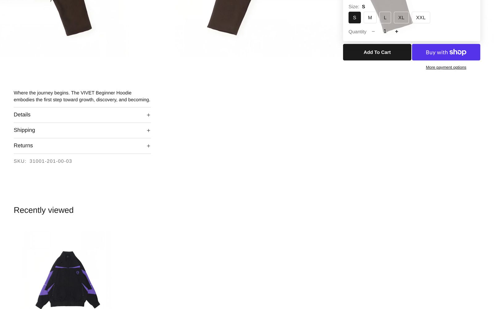
The products a shopper opened before, newest first, leaving out the one in front of them. It stays hidden until they have opened a second product, and remembers only what they viewed in that browser. In the editor it shows products from your store so you can style it. Its settings match Products: Recommended, without Products to show.
Related
- Set up size guides
- Show who's wearing it
- Set up color swatches
- Theme settings, for quick add, favorites and badges