Moodboard
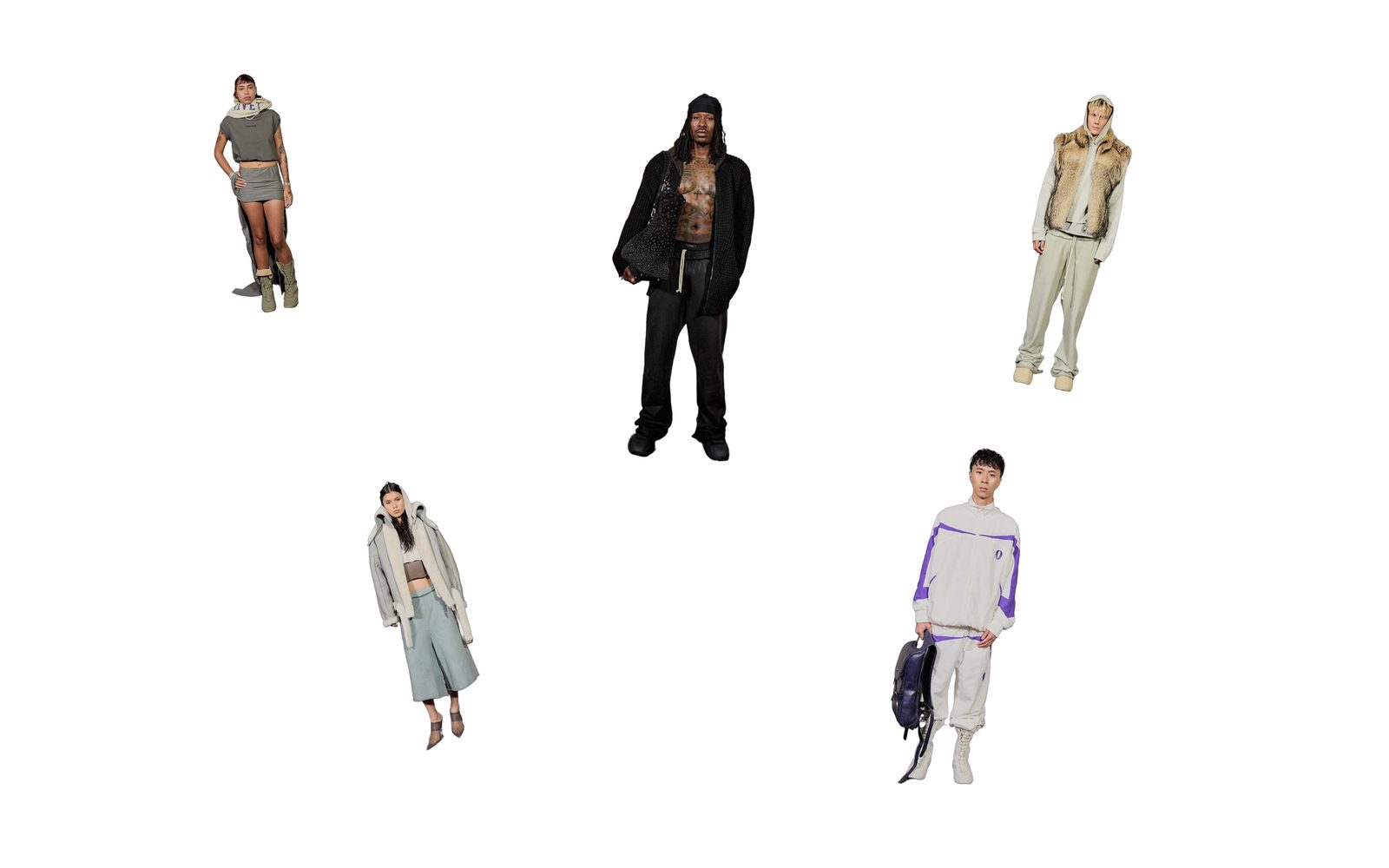
Photos scattered across a board at the spots, sizes and angles you choose, each one able to link to a product.
A board of photos you place by hand: each one at its own spot, size and tilt, overlapping where you want. Nothing slides or changes by itself. Pointing at a photo can make it move or play a sound, and a photo can open a product or any page. Choose it for a campaign or a mood, when a tidy grid feels too neat.
Add it
Add it to any page except the password page, from Storytelling in "Add section". It cannot go in the header or footer.
As first added it fills the screen with five photo blocks, tilted and overlapping. Until you choose pictures, each shows one of Shopify's sample drawings.
What you need
- Five to ten photos, or products whose main photo you want to use.
- Photos with a clear subject. Photos are never cropped: each keeps its own shape, so mixing tall and wide shots works.
Settings
Select the section itself to see these.
| Setting | What it changes | Options |
|---|---|---|
| Color scheme | The board's background. See shared settings. | Default: Scheme 1. |
| Height | How tall the board is, compared with the screen: Short is 80%, Full screen 100%, Tall 120%. | Short, Full screen (default), Tall |
| Width | How wide the board is. Narrow, Medium and Wide each have a smallest width the board keeps (about 1000, 1200 and 1400 px). On a smaller screen shoppers swipe or drag sideways to see it all. On a big screen it stops growing and sits in the middle. | Narrow, Medium (default), Wide |
| Space above and below | One choice for both: the same gap above and below the board. | None (default), Small, Medium, Large |
| Show swipe hint | A small hand sweeping side to side, so shoppers know the board moves. It only shows when the board is wider than the screen, and goes once they swipe, drag, tap or tab into it. | On (default) or off |
| Volume | How loud the photos' hover sounds play. | 0 to 100%. Default: 60%. |
With Space above and below on None, the board runs up under your header. Choose any other option and the board starts below the header instead.
Blocks
Photo
One picture on the board. Add as many as you like.
| Setting | What it changes | Options |
|---|---|---|
| Image | The picture. Leave it empty to use the main photo of the product under Product. | Any image. |
| Link to | What happens when a shopper clicks the photo. | None, Product (default), Link. As added: None. |
| Product | The product the photo opens, when Link to is Product. Its main photo is used if Image is empty. | Any product. |
| Link | Appears when Link to is Link. Any page or address. | |
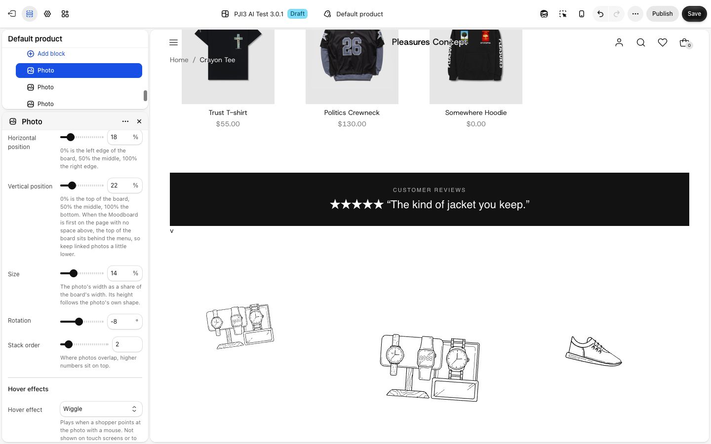
| Horizontal position | Where the photo's middle sits across the board: 0% left edge, 50% middle, 100% right edge. | Default: 50% |
| Vertical position | The same, top to bottom. | Default: 50% |
| Size | The photo's width, as a share of the board's width. Its height follows its own shape. | 5 to 40%. Default: 18% |
| Rotation | Tilts the photo left (minus) or right. | -45 to 45°. Default: 0° |
| Stack order | Where photos overlap, a higher number sits on top. | 1 to 10. Default: 1 |
| Hover effect | What the photo does when a shopper points at it with a mouse. | None, Wiggle, Lift (default), Grow, Tilt toward the pointer |
| Hover sound | A link to an .mp3 or .wav you uploaded in Content > Files. It plays when a shopper points at the photo. Leave empty for no sound. |
On phones
The board keeps its width, so it is wider than a phone. It opens scrolled to the middle, and shoppers swipe sideways to see the rest. Hover effects and sounds do not play on touch screens. Clicking a linked photo still opens it.
Tips
- Keep the photos you most want seen near the middle (Horizontal position 30 to 70%). That is what phones open on.
- With Space above and below on None and the section first on the page, the top of the board sits behind your menu. Keep linked photos a little lower so the menu does not cover them.
- Shoppers using a keyboard move through the photos in the order of your block list. Order the blocks left to right.
- Short sounds work best. A shopper's browser plays nothing until they have clicked or pressed a key on the page once.
Good to know
- A Photo block with no image, and no product to borrow one from, shows a sample drawing to shoppers too. Remove blocks you do not fill.
- The Product picker shows whatever Link to is set to, but the product's photo is only used when Link to is Product.
- Visitors who reduce motion on their device see no hover movement. Sounds still play.