Collections: List
The collections you choose, in your order, shown as a gallery of pictures or as rows of names beside their products.
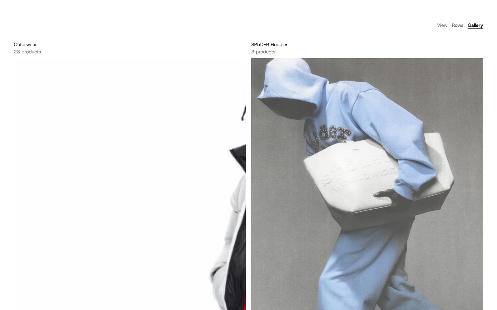
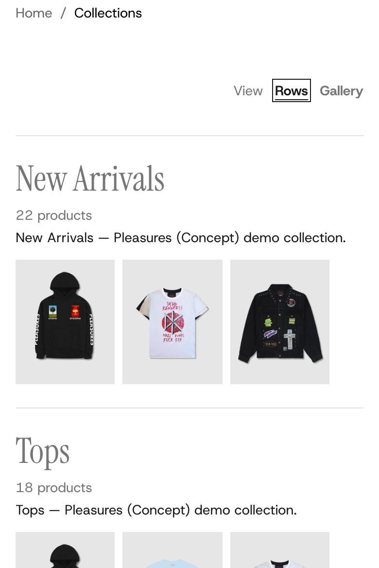
A page of your collections, in the order you set. It has two views. Gallery shows each collection's picture in a grid, with its name and product count above the picture. Rows gives each collection a full-width row: its name very large on the left, the product count and a line of description in the middle, and three of its product photos on the right. Shoppers can switch between the two, and their device remembers the choice.
It is the main section of your collections list page (the page at /collections). You can also add it to any other page.
Add it
Plain Jane puts it on the collections list page. Open that page in the editor to change it. To add it elsewhere, find Collections: List under Collections in "Add section". A page can hold only one.
Nothing is listed until you choose collections. On a new store, shoppers on the collections list page see "No collections yet." In the editor you see five sample collections, so you can style the list first. A collection you create later does not appear by itself: add it to Collections.
What you need
- The collections to list, in the order you want them. In Gallery the first two get the largest pictures, so put your most important collections first.
- A picture for each collection, set in Shopify admin. Gallery uses it; a collection without one uses its first product's photo.
- Products with photos in each collection, for the three photos in Rows.
- A short description on each collection, if you use Rows. The first words show beside the name.
Settings
| Setting | What it changes | Options |
|---|---|---|
| Color scheme | The background, text and lines. See shared settings. | Default: Scheme 1. |
| Space above, Space below | Empty space at the top and bottom. See shared settings. | Default: Medium. |
| Collections | The collections to list. Drag to set the order. | Up to 50. |
| Opens as | The view the page opens in. | Rows, Gallery. Default: Gallery. |
| Let shoppers switch | Shows a small "View: Rows / Gallery" switch above the list. The shopper's choice is remembered on their device. | Default: on. |
| Collections per page | How many collections show before the list goes on to a next page, with page numbers at the bottom. | 12, 24, 36, 48. Default: 24. |
Gallery
| Setting | What it changes | Options |
|---|---|---|
| Layout | How many collections sit side by side in each Gallery row on a computer. The two numbers take turns down the page: Two, then three gives two large pictures, then three smaller, then two again. | Two, then three; Two across; Three across; Four, then three; Custom. Default: Two, then three. |
| First row, Next row | Your own two numbers. Appear when Layout is Custom. | 1 to 4. Defaults: 2 and 3. |
A last row that comes up short shares its width between the collections it has.
Blocks
Four blocks are always there and repeat for every collection. You cannot remove or reorder them, but you can hide Product count and Description.
| Block | What it shows | Settings |
|---|---|---|
| Collection name | The collection's name, from Shopify admin. | Style: Heading 1, Heading 2, Heading 3 (default Heading 2). This sets the size in Rows; in Gallery names are body size. |
| Product count | How many products the collection holds, such as "12 products". | None. Hide the block to leave counts out. |
| Description | About the first sixteen words of the collection's description, on up to two lines. Rows only. | None. Hide the block to leave descriptions out. |
| Photos | The pictures. | Row pictures: Product photos (three from the collection, uncropped, the same height) or Collection image. Default: Product photos. Gallery picture shape: Portrait, Square, Landscape (default Portrait); Gallery pictures are cropped to it. Corners: None, Slight, Round (default None). |
Header
Not there at first: the page opens straight on the list. Add a Header block for a title above it. It starts with a Heading ("Collections", in Heading 1), and you can add a Description, Text, a Button or other blocks under it. Alignment: Left or Center (default Left).
On phones
Gallery shows two columns, whatever the Layout. The first collection runs across both, and so does the last when it would otherwise sit alone. In Rows, the name sits above the photos, and the photos swipe sideways.
Tips
- Use Rows when your product photos are strong and the collections are few. Use Gallery when you have many collections or good collection pictures.
- In Rows, cutout product photos on a white background look best, because the three photos stand side by side with no boxes around them.
- Turn off Let shoppers switch if you only like one view. Then the page only loads what that view needs.
Good to know
- On a computer in Rows, the row under the pointer comes forward and the other rows' photos fade back. The photos rise into place as each row scrolls up the screen. Visitors who reduce motion on their device see them still.
- The whole row or picture is one link to the collection.
- In the editor the list always opens in Opens as, never in a view you chose as a shopper.