Theme settings
Every store-wide choice in Plain Jane, group by group, and what each one changes.
Theme settings hold the choices that apply to your whole store. Open them from the brush icon in the editor. The groups are listed A to Z, the same order you see in the editor.
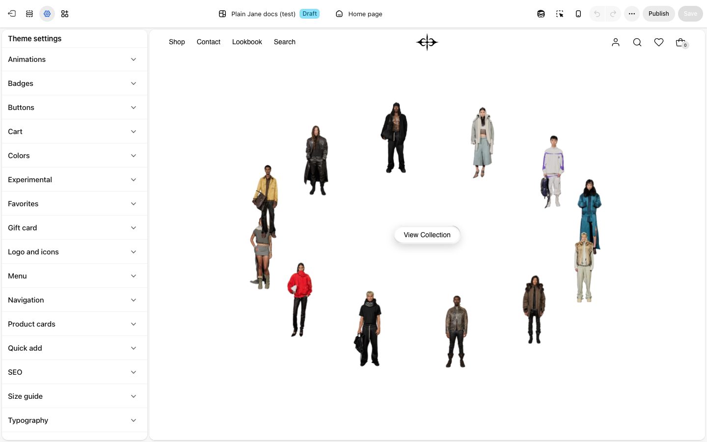
Animations
How things move as shoppers browse.
| Setting | What it changes | Options |
|---|---|---|
| Page transition | How one page gives way to the next. The next page always shows the moment it is ready. | None (default), Crossfade, Lift, Slide, Blinds, Pixelate |
| Cover color | The color that covers the screen between pages. Empty uses your text color. | Any color |
| Motion | The pace of every animation in the store. Calm slows everything down. | Lively (default), Calm |
| Content fades in as it appears | Headings, pictures and rows fade in and rise a little the first time they scroll into view. | On (default) |
| Stop the highlight sliding | The marker under the selected link in collection menus and blog posts jumps instead of sliding. | Off (default) |
Shoppers who turn on Reduce Motion on their device see no animations, whatever you choose here.
Badges
The Sale, Sold out and Pre-order labels on product cards.
| Setting | What it changes | Options |
|---|---|---|
| Corners | The badge corners. Blog post tags and the gift card badge follow it too. | None (default), Slight, Round |
| Badge position | Which corner of the product picture the badge sits in. | Top left, Top right (default), Bottom left, Bottom right |
| Text case | Whether badge words are in capitals. | Default, Uppercase (default) |
| Sale badge color scheme, Sold out badge color scheme, Pre-order color scheme | The colors of each badge. | Any of your color schemes |
Buttons
Every button in the store comes in one of three styles: Primary button, Secondary button and Glass button (see-through, for buttons over photos). Each style has the same three settings.
| Setting | What it changes | Options |
|---|---|---|
| Corners | How rounded the button is. | None, Slight (default), Round |
| Font | Which of your fonts the button uses. | Body (default), Heading |
| Text case | Whether button words are in capitals. | Uppercase, Default (default) |
Button colors come from each section's color scheme, not from here.
Cart
| Setting | What it changes | Options |
|---|---|---|
| Use a slide-out cart | The bag icon opens the cart in a panel at the side of the page. Turn it off to send shoppers to the cart page instead. | On (default) |
See Cart.
Colors
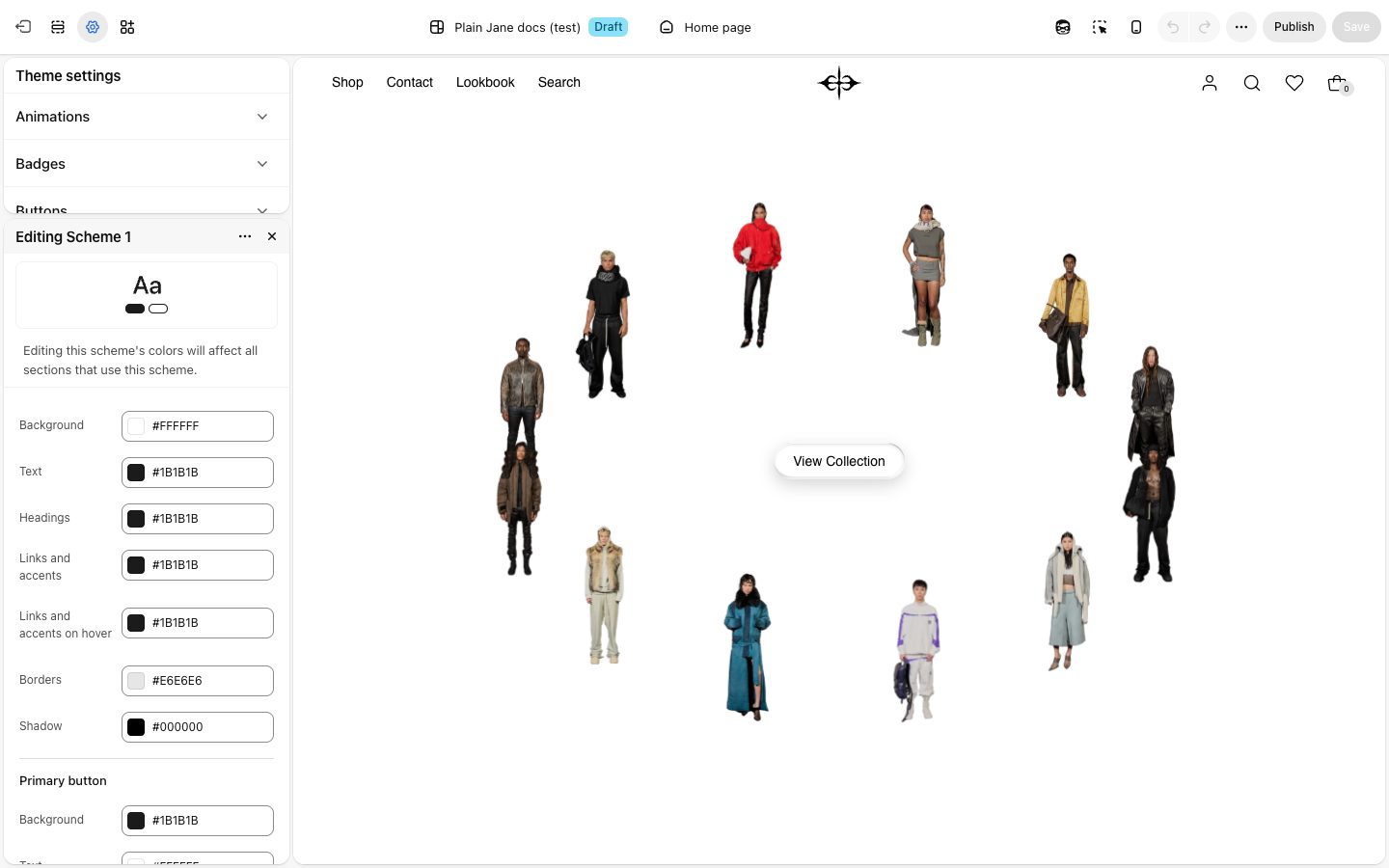
Your color schemes. Each scheme is a set of colors: Background, Text, Headings, Links and accents, Borders, Shadow, and the colors of primary and secondary buttons, including their hover colors. Every section picks one scheme in its Color scheme setting, so changing a scheme here changes every section that uses it.
Plain Jane starts with four schemes: white, warm off-white, near-black, and a see-through one for sections that sit over photos. See Color scheme.
Experimental
New features still being tested. Each changes how your whole store behaves, so try them on a copy of your theme first. All are off to start.
| Setting | What it changes |
|---|---|
| Keep the page alive between links | New pages come in without reloading the browser tab, so music keeps playing and pages change faster. Apps may stop working after the first page a shopper opens, and analytics and ad tracking may only count that first page. Best for stores without apps or ads. |
| Show music players on phones | Shows the music players on phones too. Phones stop the music on every new page unless Keep the page alive between links is on. |
| Smooth scrolling | Scrolling with a mouse glides to a stop, like a gallery site. Safari, phones, tablets and the editor always scroll as usual, so preview your store to feel it. |
Favorites
The heart button shoppers use to save products.
| Setting | What it changes | Options |
|---|---|---|
| Show favorite button on desktop | Shows the heart on product cards when a shopper points at them. | On (default) |
| Show favorite button on mobile | Shows the heart on phones, where it is always visible. | Off (default) |
| Saving animation | What shoppers see when they save a product. | None, Drift to the header (default), Burst in place |
Gift card
The page customers open from the link in their gift card email. It uses your first color scheme and your fonts.
| Setting | What it changes | Options |
|---|---|---|
| Card picture | A picture on the front of the card. Empty gives a card in your colors and fonts. | Any picture |
| Show logo and value on the picture | Turn off if your picture already shows your logo and the amount. | On (default) |
| Show logo on the card | Your logo from Logo and icons, in the card's text color. Without a see-through PNG or SVG, your store name shows. | On (default) |
Logo and icons
| Setting | What it changes |
|---|---|
| Logo | Your logo. Headers and logo blocks show it unless you pick a different picture in them. Until you add one, your store name shows. |
| Favicon | The small picture in the browser tab. Use a square picture, at least 32 by 32 pixels. |
| Home screen icon | Shows when a shopper saves your store to their phone's home screen. Use a square picture, at least 180 by 180 pixels. |
| Cursor image | Replaces the mouse pointer on computers. Use a small square PNG with a see-through background. |
Menu
| Setting | What it changes |
|---|---|
| Menu | The links in your header and in the full-screen menu, on computers and phones. Start with your main menu. Make or change menus in Shopify admin, under Content, then Menus. |
Navigation
| Setting | What it changes | Options |
|---|---|---|
| Open product pages instantly | On computers, a product page gets ready while the shopper's pointer rests on it, so it opens complete. Shopify's analytics may also count products shoppers only pointed at. | Off (default) |
| Send homepage visitors to another page | Shoppers who open your home page go straight to another page. The editor still shows the home page so you can keep working on it. | Off (default) |
| Send them to | The page they go to. Empty sends them to All products. Shows when the setting above is on. | Any page |
Product cards
| Setting | What it changes | Options |
|---|---|---|
| Corners | Rounds the product picture on cards and grids. | None (default), Slight, Round |
Quick add
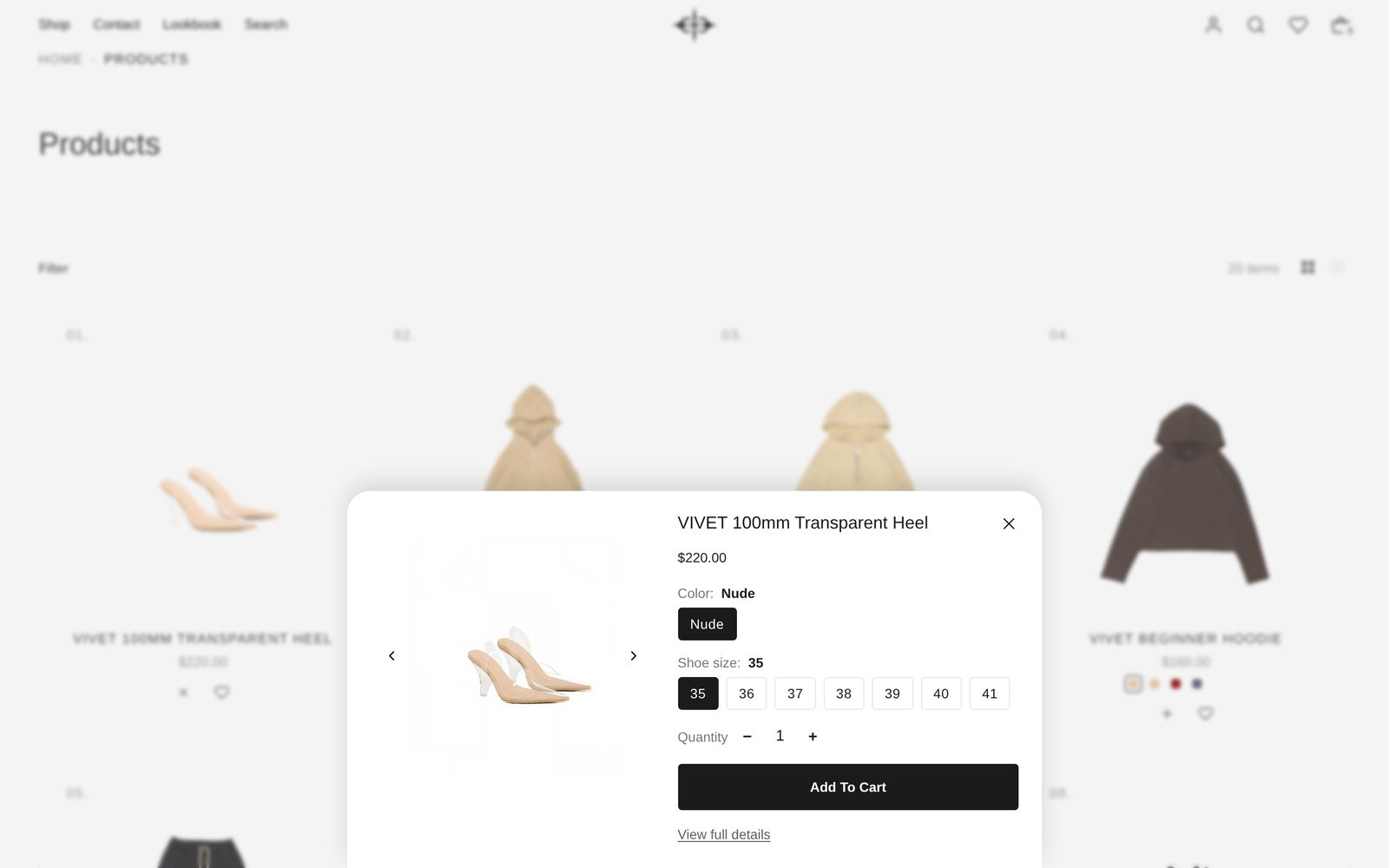
The window that opens when a shopper presses + on a product card. Its title, price, options and buttons always match your product page.
| Setting | What it changes | Options |
|---|---|---|
| Show quick add button on desktop | Shows + on product cards on computers. A product with one option goes straight to the cart; others open the window. | On (default) |
| Always show on desktop | Keeps the + and heart in view, instead of only when the shopper points at the card. | Off (default) |
| Show quick add button on mobile | Shows + on phones, where it is always visible. | Off (default) |
| Corners | The window's corners. | None (default), Slight, Round |
| Color scheme | The window's colors. | Any of your color schemes |
| Frosted glass | The page shows through the window, softly blurred. | Off (default) |
| Blur the page behind | Blurs the page while the window is open, so it stands out. | On (default) |
| Show "View full details" link | A link to the full product page. | On (default) |
SEO
| Setting | What it changes |
|---|---|
| Show product details in search results | Tells search engines like Google your product's price, stock and brand, which they can show under the link. On to start. |
| Show blog post details in search results | Tells search engines each post's author, date and picture. On to start. |
Size guide
The guide that opens from the link beside a product's sizes. Setting one up is covered in Set up size guides.
| Setting | What it changes | Options |
|---|---|---|
| Color scheme | The guide's colors. | Any of your color schemes |
| Units shown first | With Shopper's country, shoppers in the United States see inches and everyone else centimeters. A shopper's own switch is remembered. | Shopper's country (default), Centimeters, Inches |
| Shoppers can pick a size and add to cart in the guide | Shows size buttons and Add to cart beside the measurements. | On (default) |
Typography
Your fonts and text sizes.
Fonts. Plain Jane uses four fonts: Body font for paragraphs, Subheading font, Heading font, and Accent font for small details. For each one, choose a Font source:
- Shopify font library gives you a Font picker with Shopify's free fonts.
- Custom font file lets you use your own font. Upload the .woff2 file in Shopify admin under Content, then Files, copy its link, and paste it into Font file URL (.woff2). Give it any Font name.
Sizes. Sizes are for computers. Heading 1 and Heading 2 get smaller on phones by themselves so they fit.
| Setting | What it changes | Options |
|---|---|---|
| Paragraph: Size | The size of body text across the store. | 14px (default), 16px, 18px |
| Paragraph: Line height | The space between lines of body text. | Tight, Normal (default), Loose |
| Heading 1 to Heading 6 | Each heading size has its own Font, Size, Line height, Letter spacing and Case. Headings in sections pick one of these six. | Sizes from 16px to 184px |
Headings start at 72px (Heading 1), 48px, 32px, 24px, 18px and 16px (Heading 6).