Blog posts: Feed
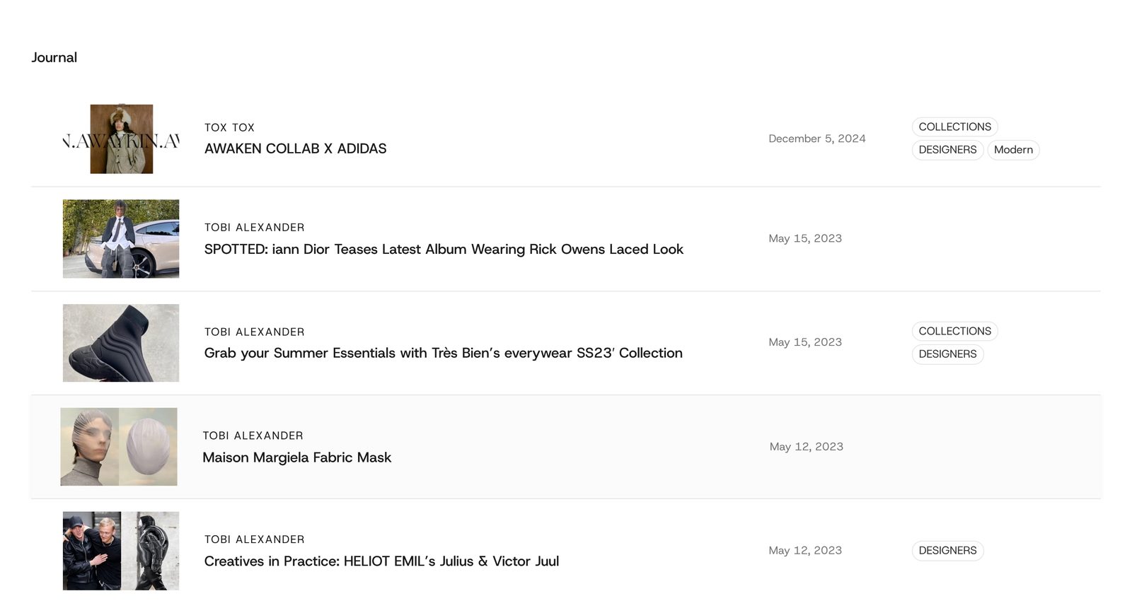
Your latest blog posts as a list of rows, each with a small photo, the author and title, the date and the tags, like a contents page.
A list of your newest blog posts, one row per post, lined up in columns down the page. Each whole row is a link to the post. Choose it when you want your journal to read like a contents page rather than a grid of cards.
Add it
Add it to any page except the password page, from Storytelling in "Add section". It cannot go in the header or footer.
As first added it has the heading "Journal" and rows with a photo, the author over the title, the date and the tags. Until you choose a blog, the editor shows three sample rows. Shoppers see nothing at all until the section has a blog with posts.
What you need
- A blog with at least three posts.
- A featured image on each post. A post without one shows a gray placeholder drawing in the photo column.
- Tags on your posts, if you keep the Tags column. A post with no tags leaves that column empty.
Settings
Select the section itself to see these.
| Setting | What it changes | Options |
|---|---|---|
| Blog | Which blog the posts come from. Newest first. | Any blog. Default: none chosen. |
| Posts to show | How many rows show on desktop. | 3 to 12. Default: 6. |
| Posts to show on a phone | How many of those rows show on phones. It can never show more than Posts to show. | 2 to 12. Default: 3. |
| Color scheme | Background, text, lines between posts and tag outlines. See shared settings. | Default: Scheme 1. |
| Width | Page width lines the rows up with your other sections. Full width runs the heading and rows to the screen edges. | Page width (default), Full width |
| Space below heading | The gap between the heading and the first row. | None, Small, Medium, Large (default) |
| Space above, Space below | See shared settings. | As added: Medium. |
Blocks
Three fixed blocks hold everything: Heading with button, Post list and Post row. You cannot remove them.
Heading with button
The heading above the list. As added it holds one Heading ("Journal", style Heading 5). Add a Button beside it to link to your blog page. Position sets where the heading row sits (Left, Center, Right, or Spread across the row to push the button to the far side). Space between sets the gap between the heading and the button. If you remove everything inside, shoppers see no heading and no gap.
Post list
How the rows stack.
| Setting | What it changes | Options |
|---|---|---|
| Space between posts | Gap between rows. | None (default), Small, Medium, Large |
| Lines between posts | Between posts draws a line between rows. Above every post also draws one above the first row. | None, Between posts (default), Above every post |
| Line thickness | Appears when lines are on. | Thin (default), Thick |
| Highlight a post on hover | Pointing at a row tints its background and makes it grow very slightly, so shoppers can tell the whole row is a link. | On (default) or off |
Post row
One set of settings for every row. Each block inside it is one column. Drag them to reorder the columns, or remove one to drop that column.
| Setting | What it changes | Options |
|---|---|---|
| Space between columns | Gap between columns. | None, Small, Medium, Large (default) |
| Line columns up | Whether the columns line up along their top edge or their middle. | At the top, Down the middle (default) |
| On a phone | Stack the columns puts the photo full width with the words under it. Keep them in a row keeps the desktop look with a smaller photo. | Stack the columns (default), Keep them in a row |
| Top, Bottom | Space inside each row, above and below its content. | None, Small, Medium (default), Large |
The columns:
- Photo: the post's featured image. Image shape (Adapt to image, Square, Landscape), Size (Small, Medium, Large: the column's width) and Corners (None, Slight, Round).
- Post title: the author and the title, which fill in from each post. As added it holds two Title & details blocks, one set to Author and one to Title. Add another set to Description to show the post's excerpt, or a Text block for something like a read time. Space between sets the gap between them.
- Date: when the post was published. Format (January 9, 2026; Jan 9, 2026; 1/9/2026), Case (As written, All caps) and Width (Narrow, Medium, Wide).
- Tags: the post's tags as small outlined labels. Most tags to show (1 to 6, default 3), Case, Corners (default Round) and Width. The labels are not links.
You can also add a Text or Group block as another column.
On phones
Rows past Posts to show on a phone are hidden. With Stack the columns, each post becomes photo, then words, then date and tags. The column widths you set apply on desktop only; on phones columns size themselves. An empty Tags column is hidden on phones.
Tips
- Keep Square or Landscape for Image shape if your featured images are a mix of shapes, so the rows line up evenly.
- To make it a text-only index, remove the Photo block.
- Add a Button to the heading linking to your blog, so shoppers can reach older posts.
Good to know
- The section disappears from your store when the chosen blog has no posts.
- The editor's sample rows show the sample author and title, not the blocks inside Post title. Choose a blog to see your own settings there.
- Visitors who reduce motion on their device get the background tint on hover but no growing.